

American Beauty Packaging Rebrand
Challenge: Refresh the logo and packaging for a 100-year-old pasta brand
Founded in 1916, American Beauty is a brand of pasta found online and in grocery stores west of the Mississippi. As an American-made pasta, there is some brand differentiation from more upscale Italian brands, and the economical price point makes it popular with families and people on a budget. In this refresh, I wanted to create packaging that would get the attention of new audiences—especially online—without alienating the brand’s core shopper.
Project Details
Client: Student work
Timeframe: 14 weeks
Roles: Research, Creative Brief, Design & Copy Strategy, Logo Design, Packaging Design, Typography
Skills: Illustrator, Procreate, Typography
Goals: Honor the brand’s Midwestern roots; create a more sustainable package; make it fun; visibility online and in stores
Research & Concept
Customer-centered research and thinking
After some small focus groups, I found that a lot of the people are concerned with speed and ease at dinner time. Because prep time is an issue in a lot of homes, I wanted the copy to reflect easy, fast recipes and instructions for busy people who aren’t necessarily foodies. Portion size is also a concern for some people, so I wanted to create a solution that addressed that.
As a design consideration, I wanted to move the brand away from their current plastic packaging, which contributes to landfill and is difficult to keep closed in the cupboard. Moving to a cardboard box was an easy—and more environmentally sustainable—choice.


Competitive analysis: Standing out in the pasta aisle
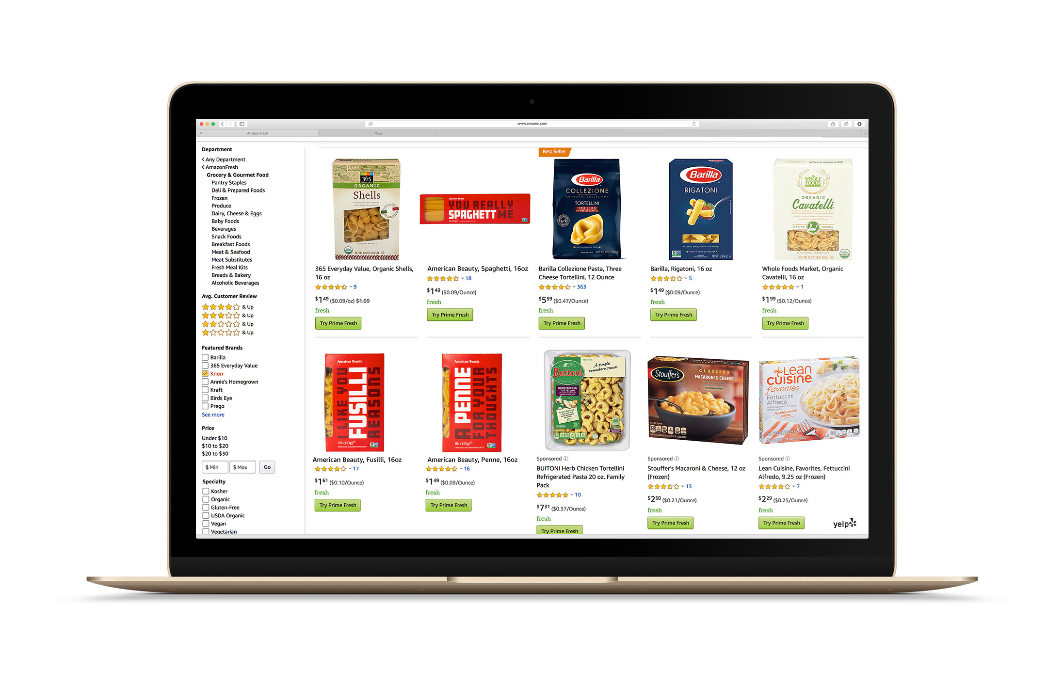
The pasta aisle is busy—consumers have a lot of choices and a number of ways to choose: price, taste, brand, specialty types. And with 49% of consumers purchasing at least some of their groceries online, it’s more important than ever to stand out in a sea of options. Online, large type, high contrast and bright colors pop out of the product grid.
Findings
American Beauty is considered an economy product (it is almost always priced under $2/package), so I looked at other less expensive brands, such as Market Pantry, No Name and Tesco Everyday, which prioritize poppy type and colors, and a simplicity of design.
Visual Design
Logo
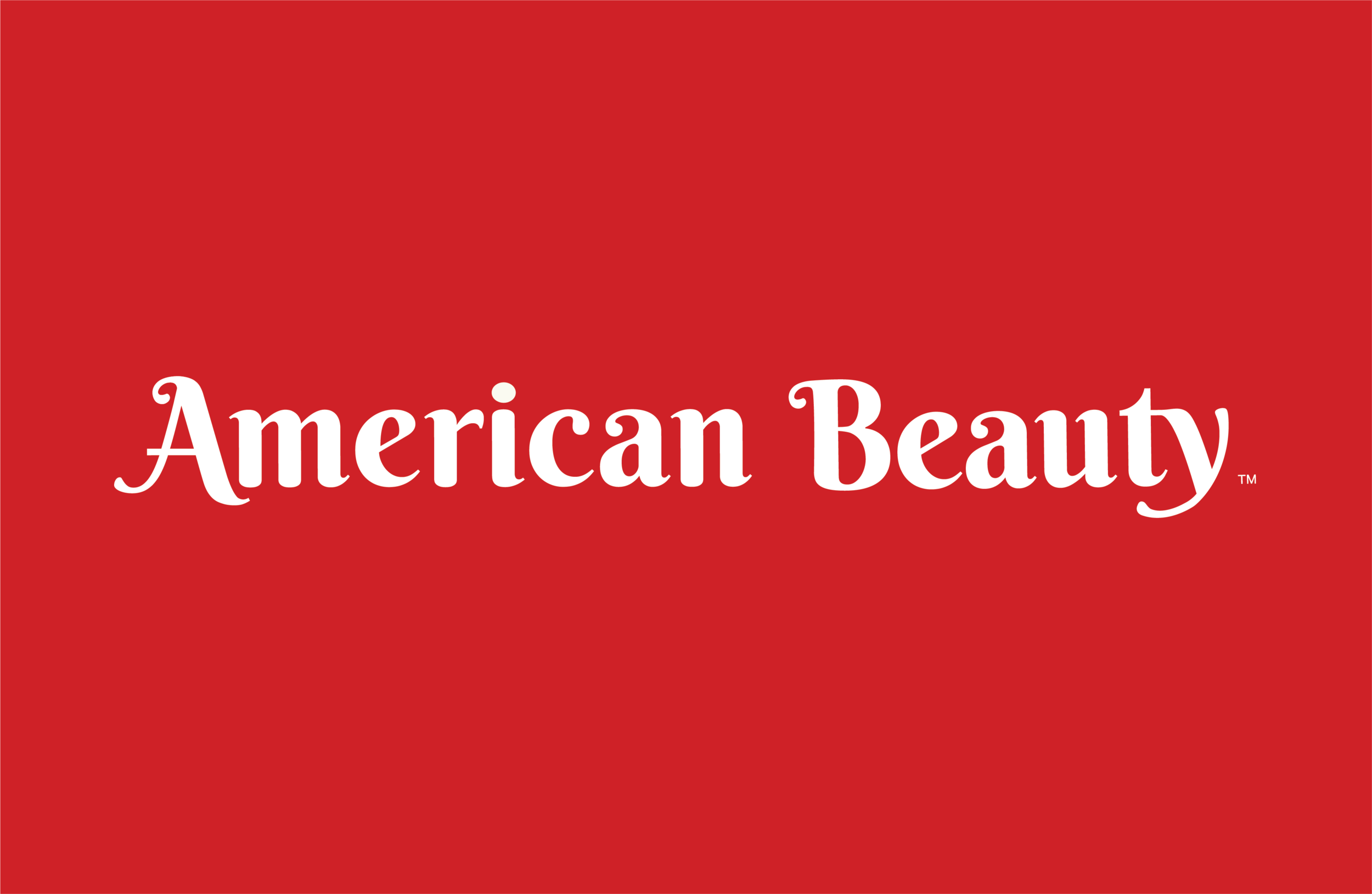
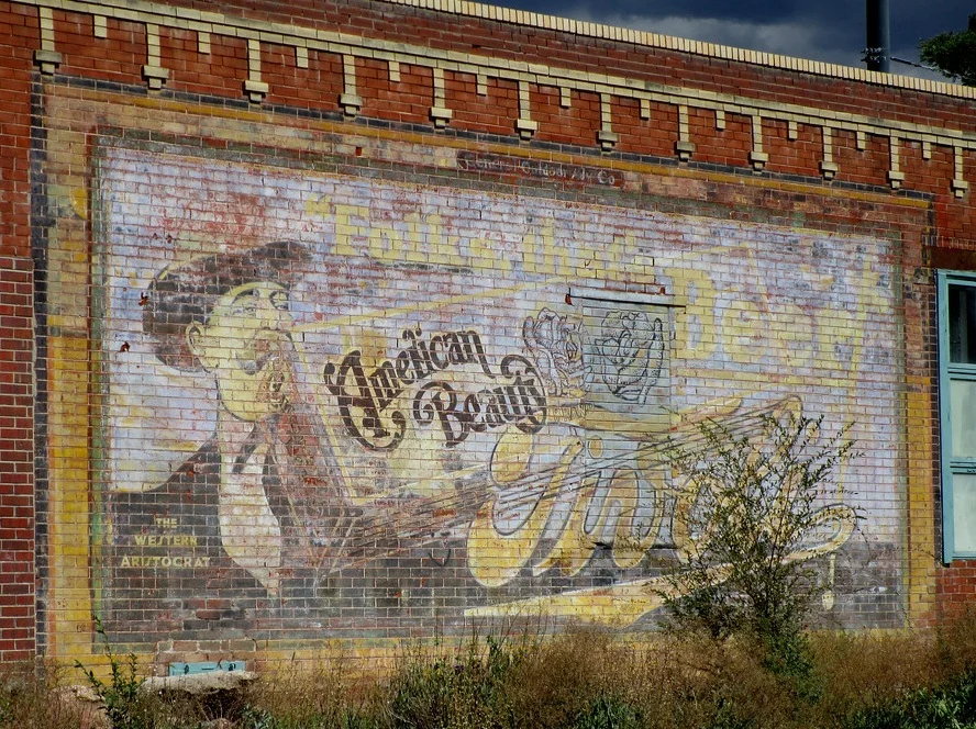
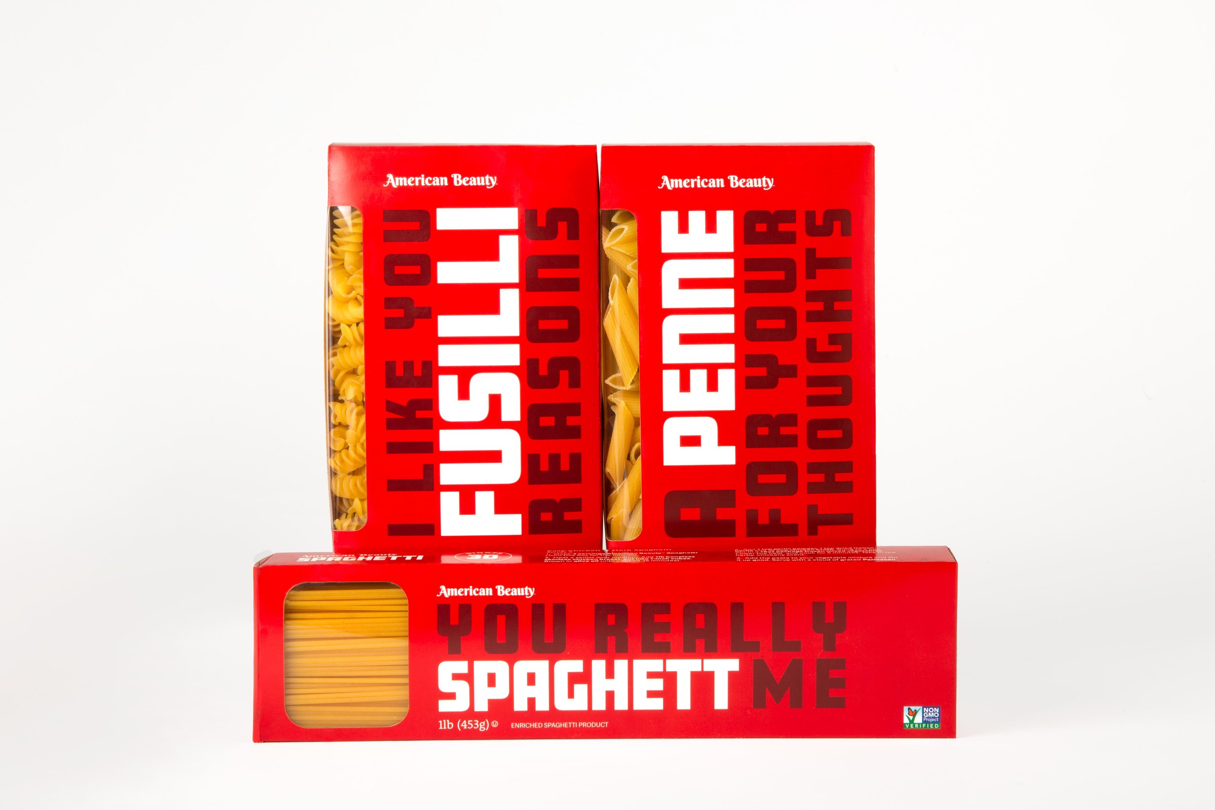
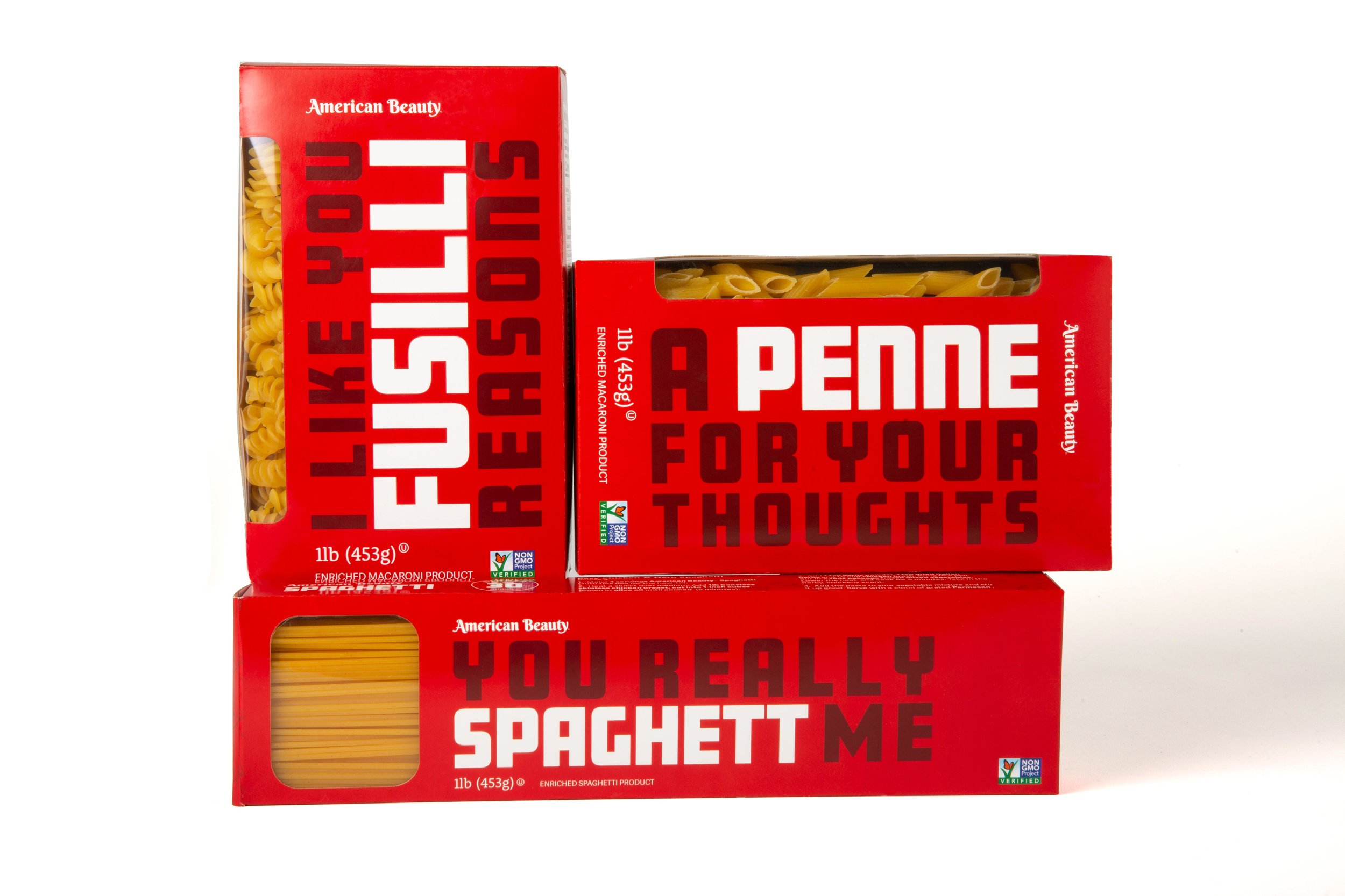
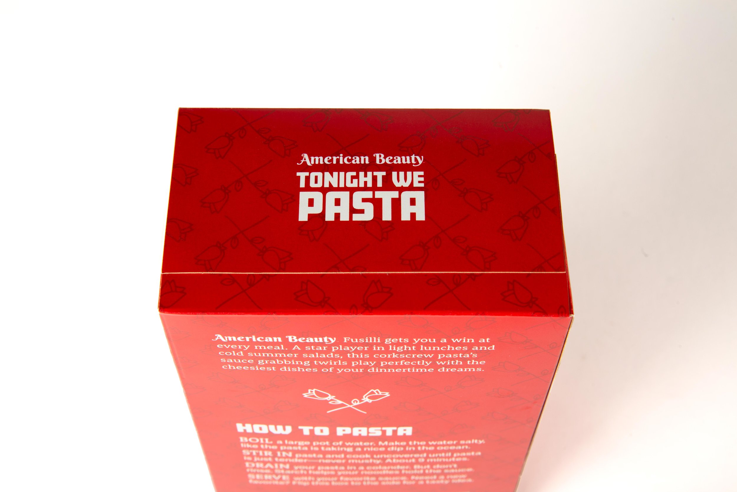
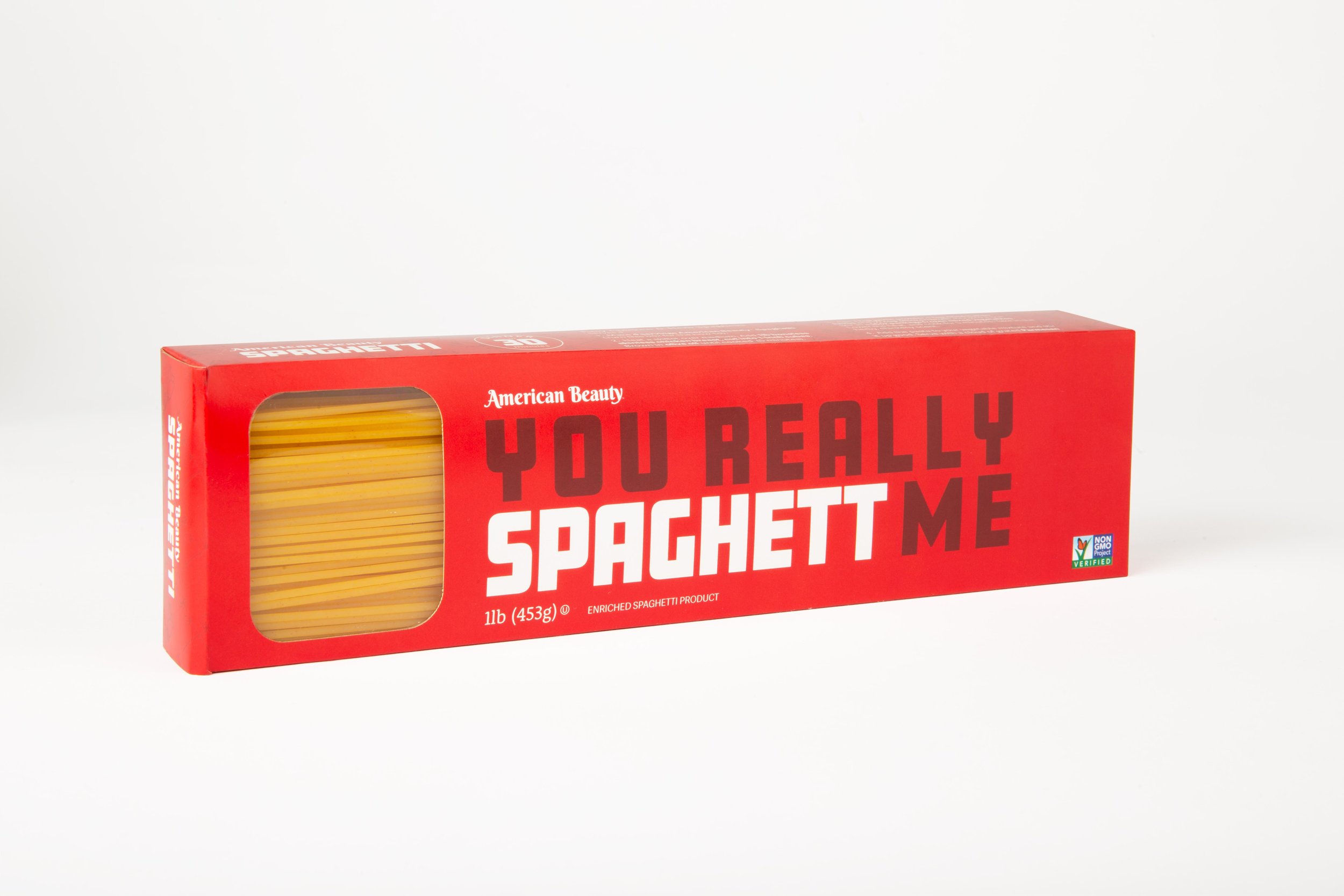
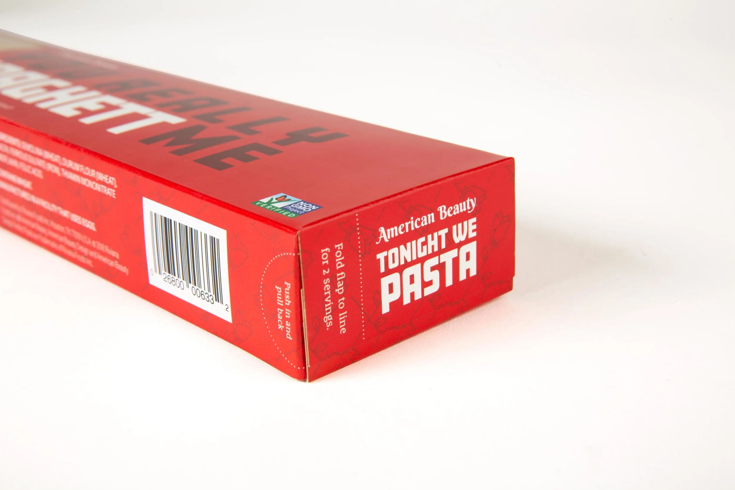
Because I wanted to honor the history of the brand, I looked into American Beauty’s visual history. The inspiration for the logo came from decorative lettering of the brand’s early style. I worked through many iterations, exploring lettering styles and the addition of graphic elements like the brand’s namesake rose. In the final word mark, I modified Berkshire Swash, a typeface that feels traditional, friendly, and reminds me of a fat bowl of pasta.
Visual inspiration & Final Design
American Beauty’s Midwestern roots and their economical price point lead me to vintage seed and flour sacks for visual inspiration. These cotton sacks were reused as an economical fabric during the Depression and were often printed with colorful patterns and designs. From these, I found type and color inspiration, as well as a use for the American Beauty rose—as a subtle background pattern. The main typeface for product names and taglines is Amboy, which was inspired by mid-century advertising. I kept the brand’s signature red, but deepened it for a more vintage feel.

Copywriting
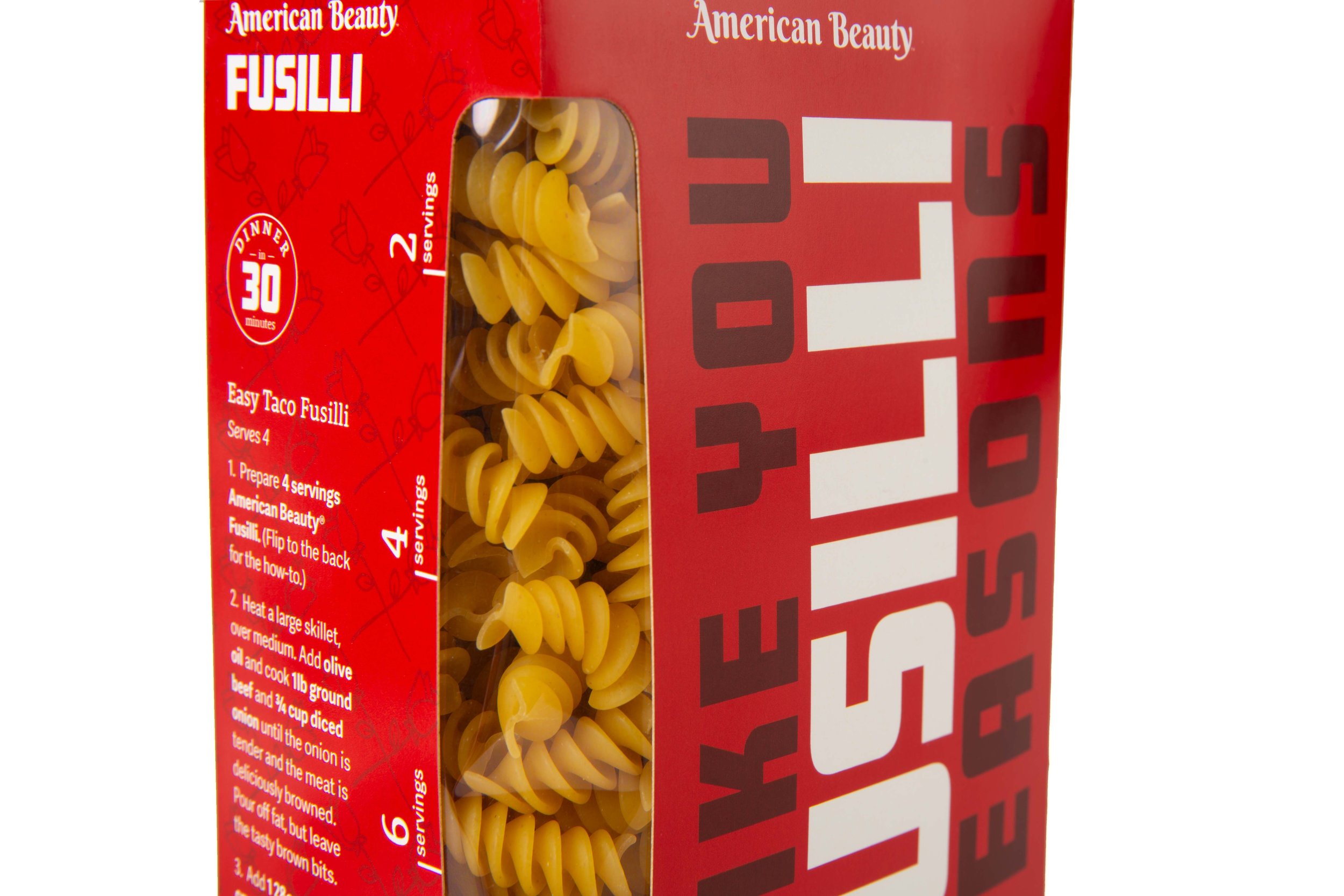
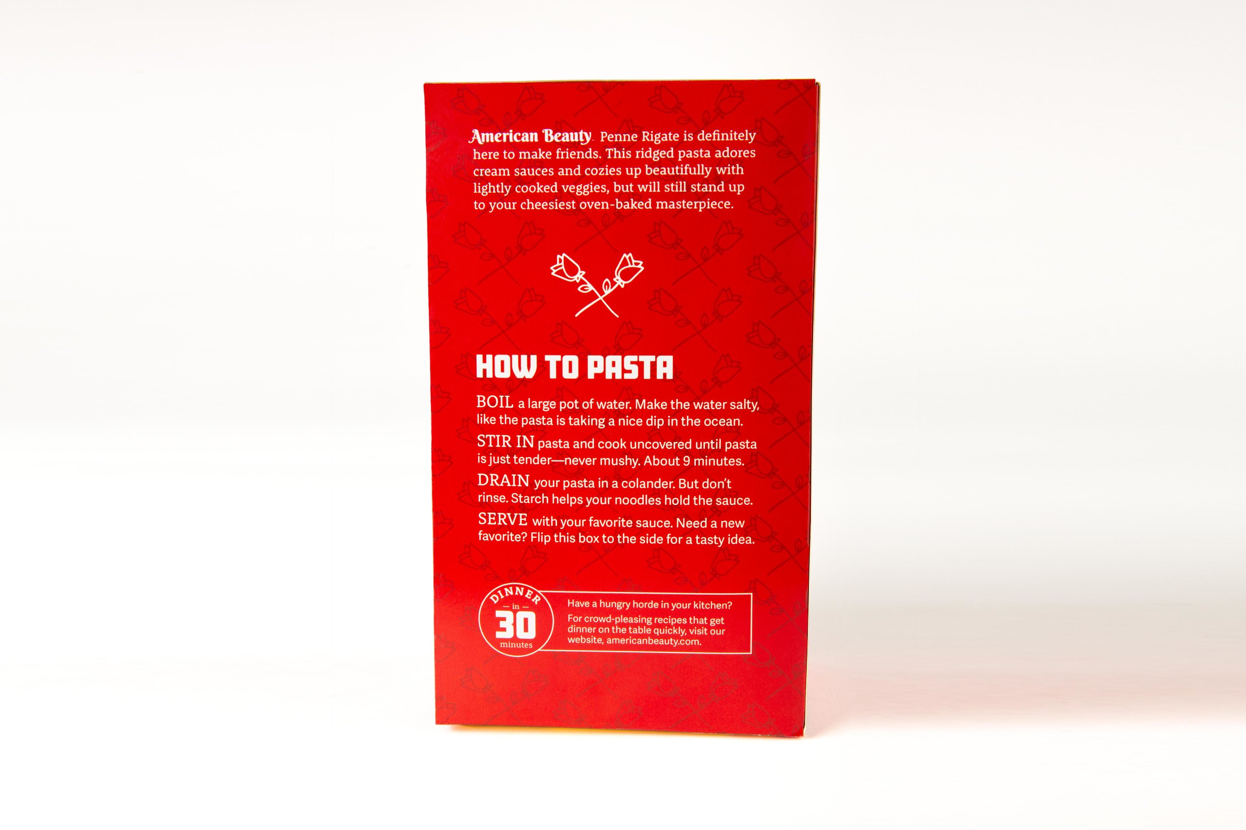
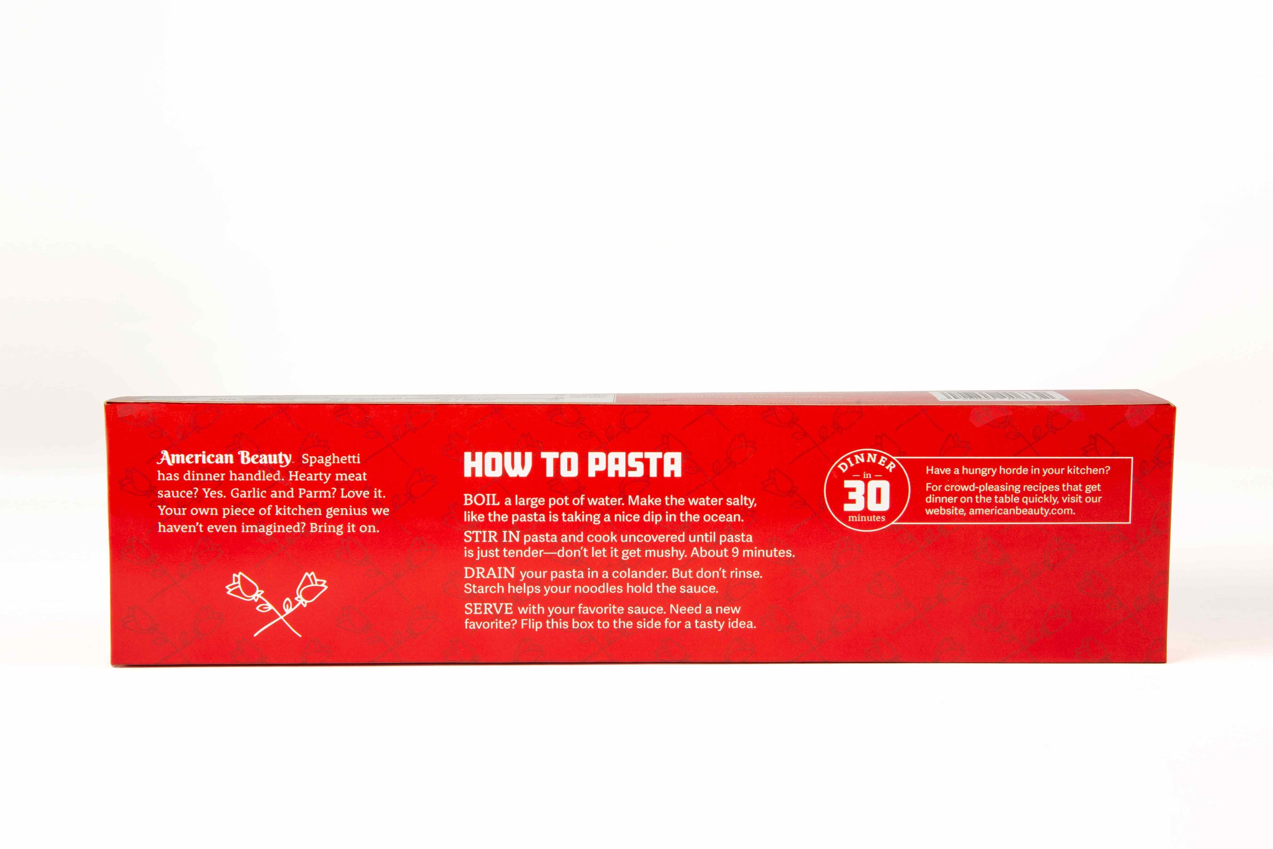
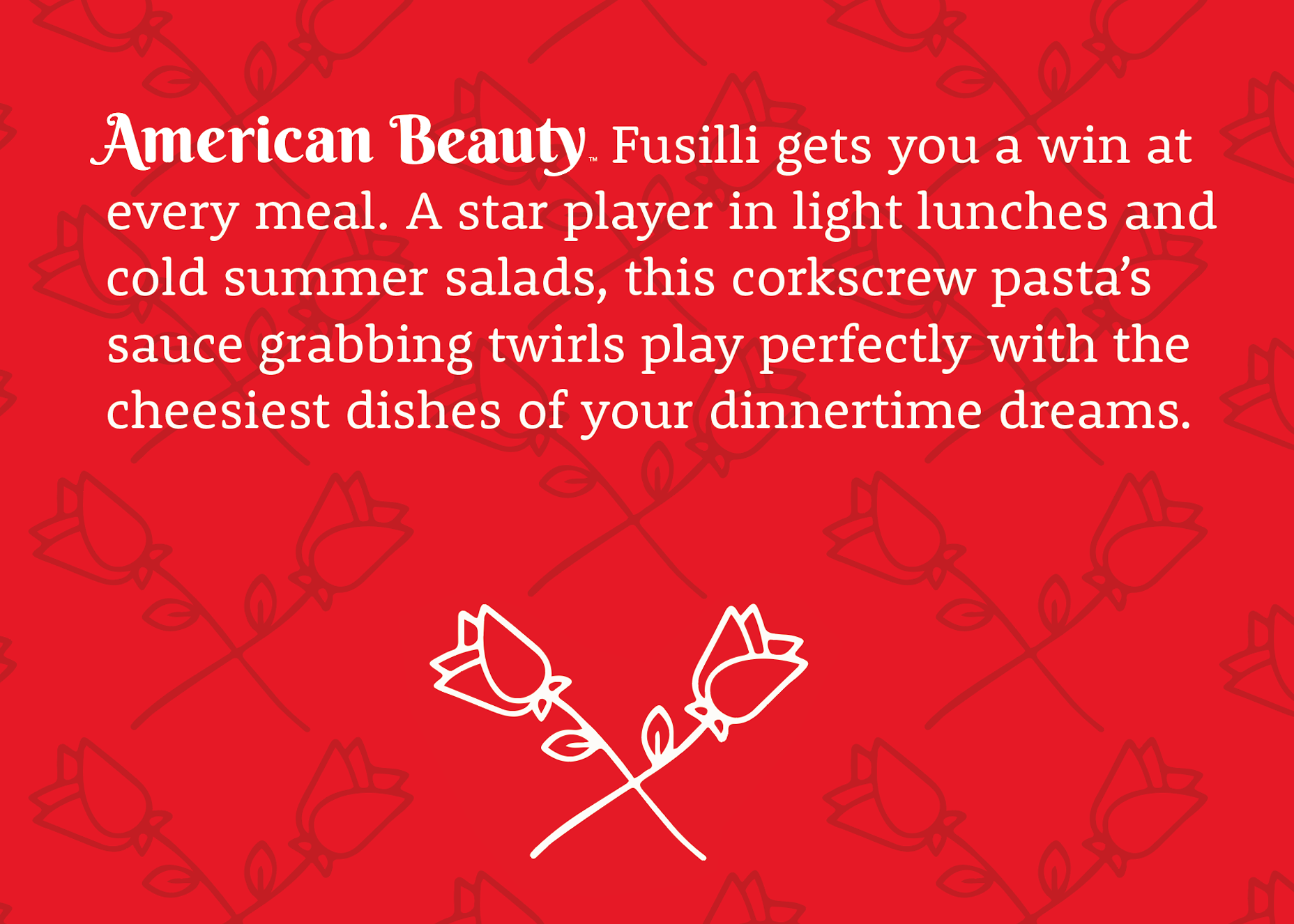
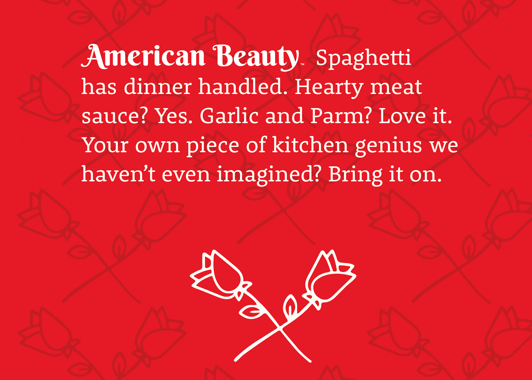
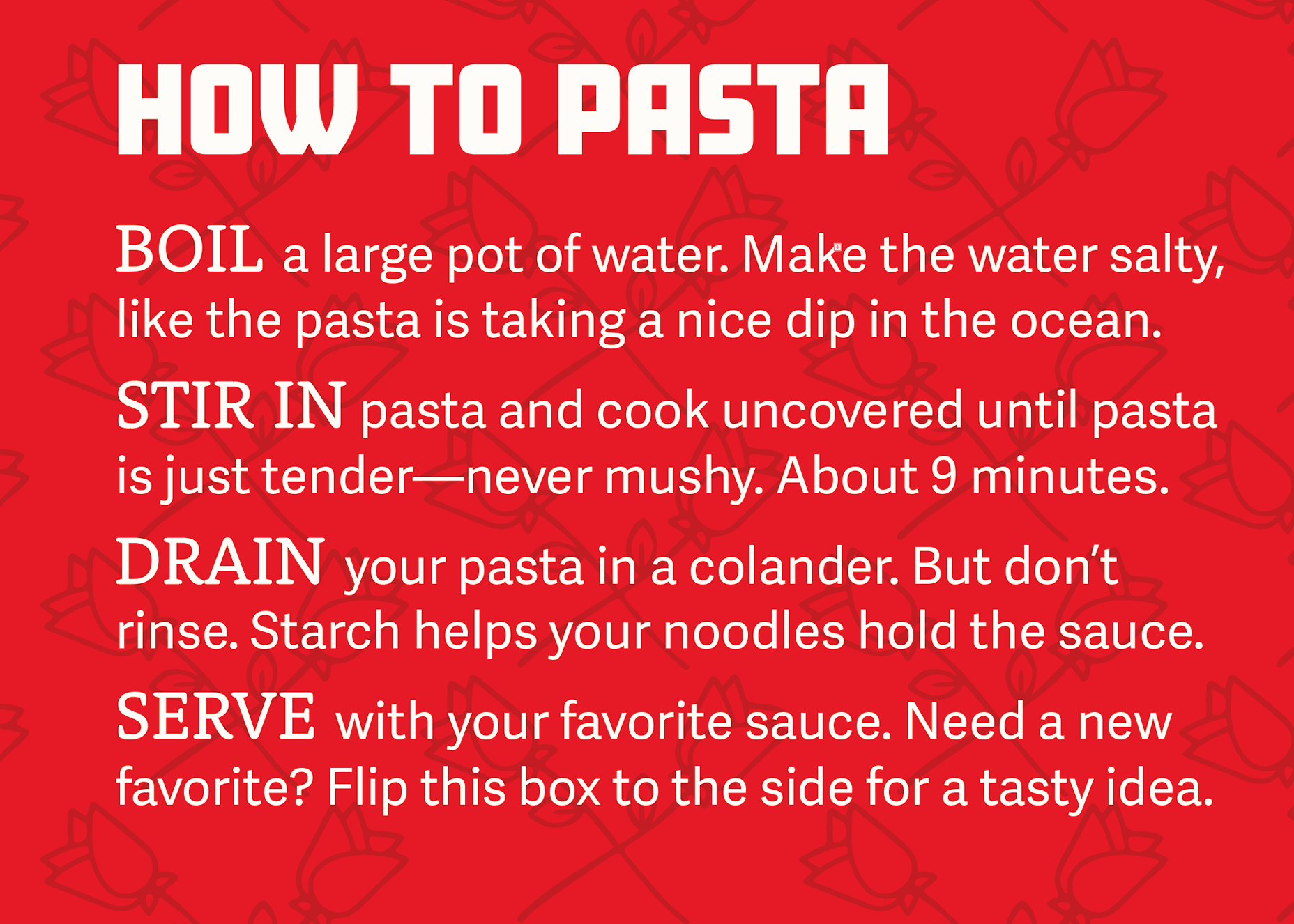
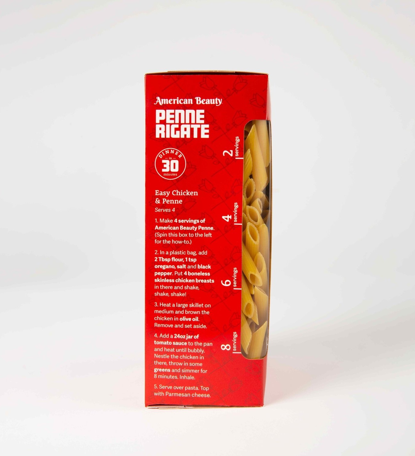
Aside from sourcing the silliest pasta puns I could find, I also created friendly bits of marketing copy, including a fun intro to each pasta shape that gives a broad overview of what kinds of dishes work best. I also punched up the copy on the brand’s current cooking instructions, giving them a bit more clarity and life.
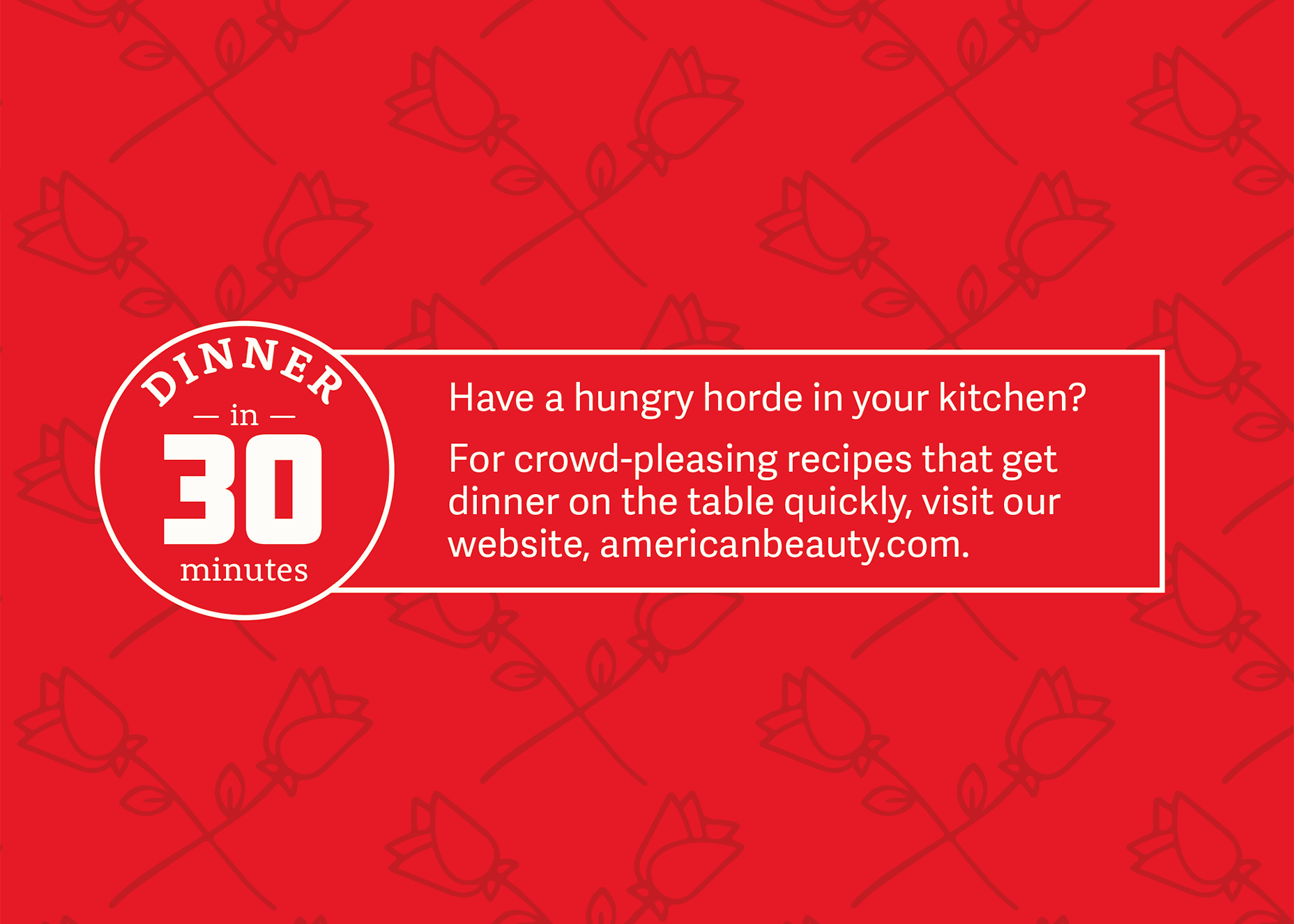
Because I know this customer is busy trying to feed a family, I created a small bug that calls out “Dinner in 30 Minutes,” which grabs the eye and directs the user to the website for simple, easy recipes. I also added this bug directly to the recipe panel (see below) for some quick identification.
Customer-centered features
Pasta has an image issue. Many people are uncertain with how much a portion of food is, and pasta especially suffers from people worrying about eating too much. To give customers a sense of control over their intake, I created simple ways to measure. On the horizontal boxes, a simple scored fold line that dispenses two portions at a time. On the vertical boxes, the product window doubles as a portion gauge.
Online storefront
One of my aims for this project was retail visibility, and I’m pleased with how well the red and white with the large type stands out in an online shopping context. The jokes screen back well enough that they’re not distracting and the product name is attention-grabbing.