
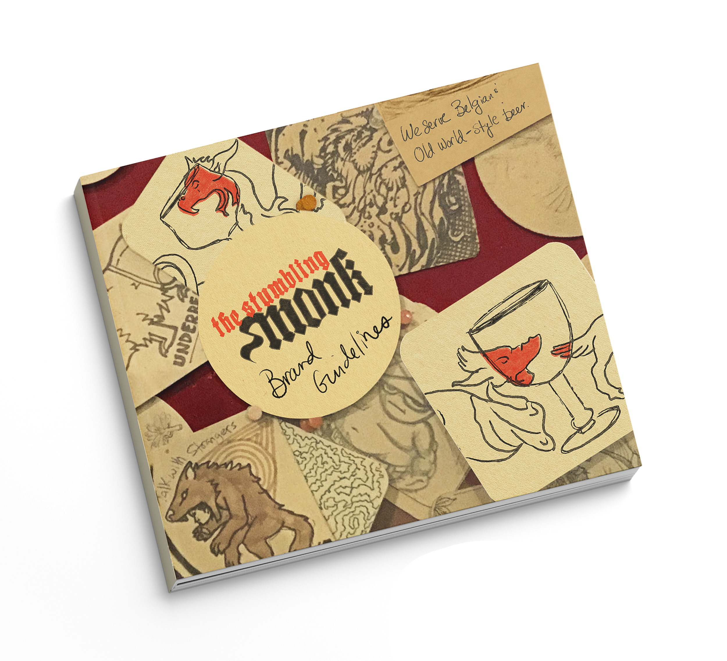
The Stumbling Monk Rebrand
Challenge: Create a branding solution for a beloved local bar that will help keep the doors open by attracting new, like-minded customers.
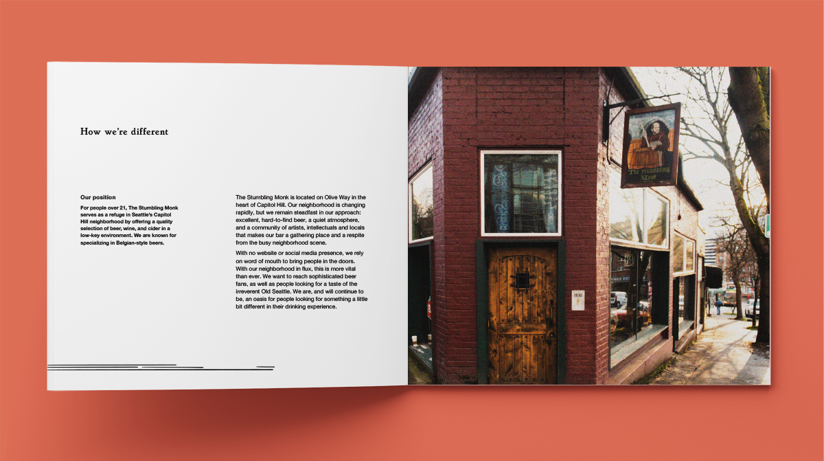
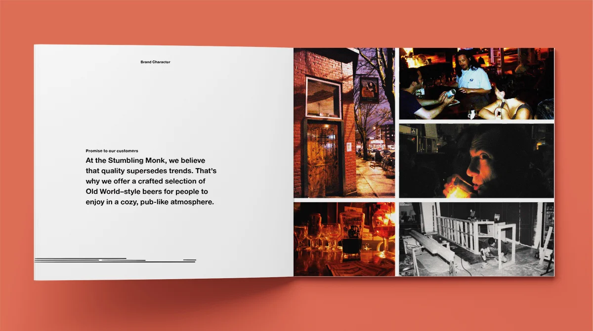
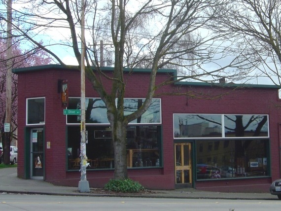
The Stumbling Monk is a local bar that serves Belgian and Old-World style beers and not much else. It has been a constant in Capitol Hill for 20 years and in the changing neighborhood climate, it is a refuge for serious beer lovers, intellectuals and other local characters. There is little in the way of decor or polish—every ounce of effort goes into sourcing the weird and wonderful beer. We wanted to create a brand that would be easy and inexpensive for the owner to deploy and would leverage a passionate group of customers that could help build this community organically.
Project Details
Timeframe: 11 Weeks (School Project)
Design Partner: Tanya Sheremeta
Roles: Visual Design, Logo Design, Research and Brand Strategy, Web & Print Design, Environmental Graphics
Skills: Photoshop, Illustrator, Research, Illustration & Lettering
Project Goals & Strategy
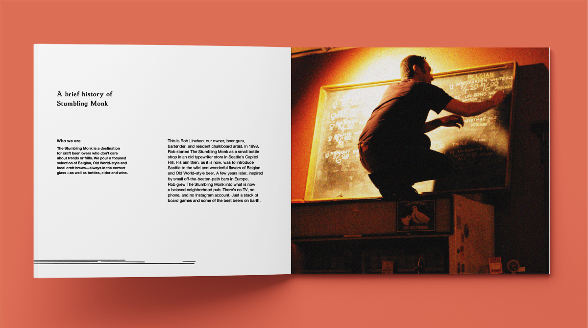
The Stumbling Monk is a special place—and it’s not for everyone. It’s a small corner bar that has changed little since it owner Rob Linehan opened his bottle shop-turned-pub in 1998—which is why so many people love it. As designers, we wanted to strike a balance that honored the spirit of the place and that wouldn’t alienate their current fans. With Capitol Hill becoming more and more expensive, it is essential to bring in new customers who connect with the values the bar espouses: adventurous beer, intellectual curiosity, and community. There’s no phone and no social media (and this is unlikely to change), so we wanted to create an easy-to-execute solution that would encourage current customers to do some word-of-mouth work.
Concept & Logo
Concept: Getting curious
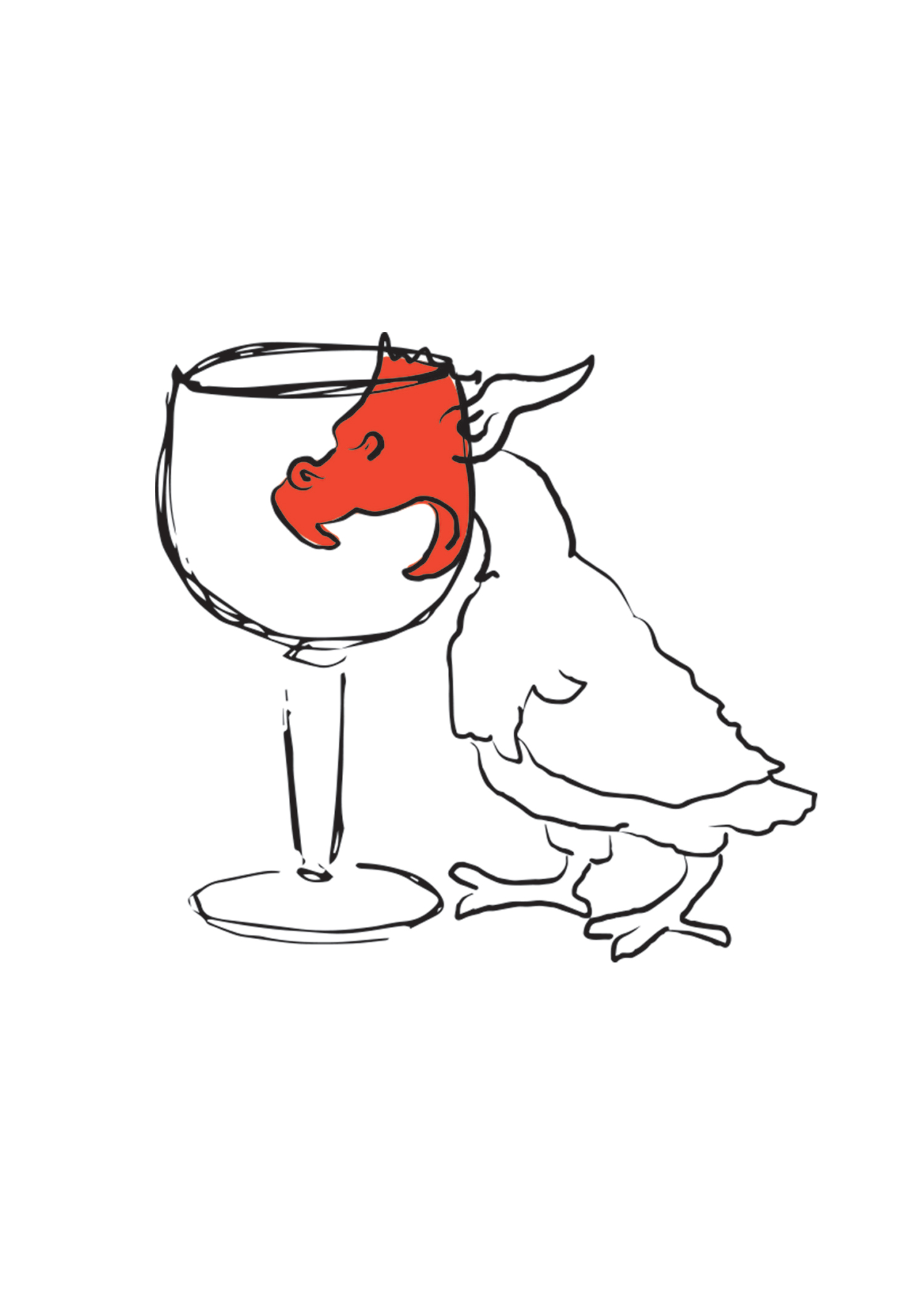
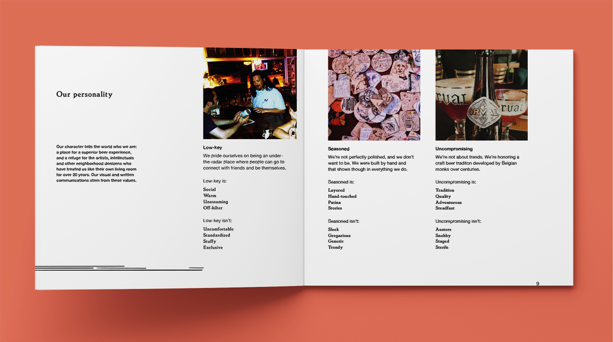
What makes this bar different is how devoted they are to the beer they serve, and how devoted their customers are in return. Many customers are long-standing, passionate fans who love The Stumbling Monk not only for the beer, but also for the laid back atmosphere that allows them to pair that beer with a good book, a game of chess or a great conversation—increasingly rare in this fast-growing neighborhood. This relationship between the bar, the beer and the people lead us to our tonal words, low-key, seasoned and uncompromising, and then to our concept: Curious beer for curious folk.
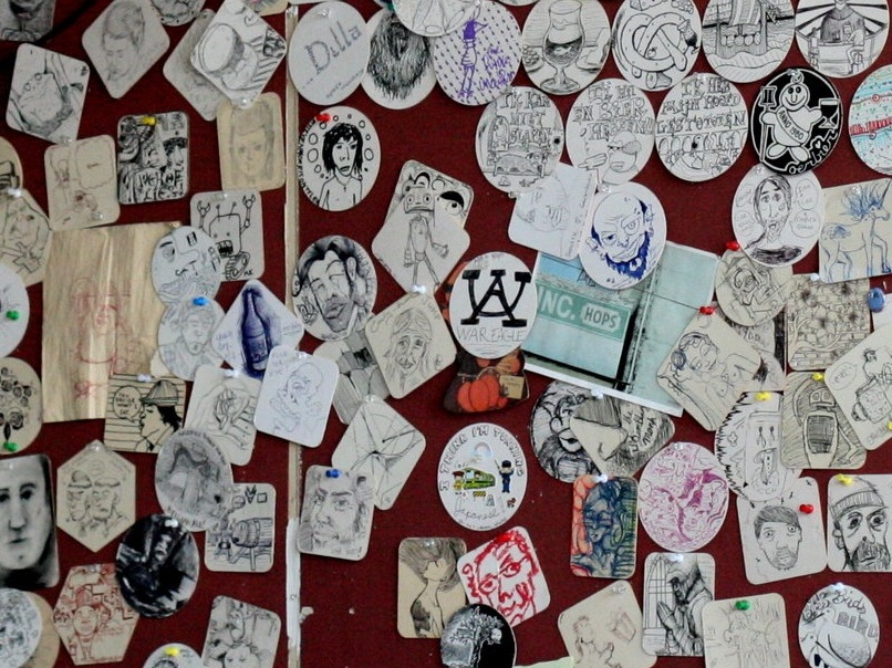
To bring this idea to life, we were inspired by medieval manuscripts, mythical creatures, toile wallpaper, photo booth pics and the ballpoint pen drawings that adorn a wall of coasters in the bar. We wanted to convey both the seriousness of the beer and the lively people and stories that fill the building each night.

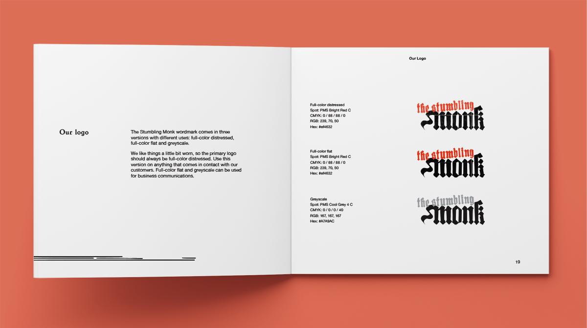
Logo: Monastery meets dive bar
For the logo, we spent a few evenings sketching while soaking in the atmosphere of The Stumbling Monk and sampling at least one glass of saison. We had a lot of fun playing with gothic lettering and came up with more than a few inebriated abbots in our process.
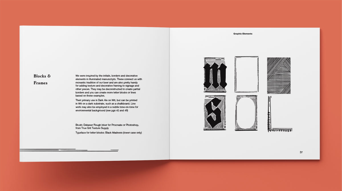
For the final logo, we kept it simple with a slightly weathered blackletter face called Black Madness. Using blackletter helped connect the logo to the long tradition of the beer and the monks who made it. Because this is also a Seattle bar, we kicked the top line of the word mark off its baseline for a touch of drunken irreverence. (The vermillion is the color of your cheeks after a couple of those saisons!)
Brand Collateral
Visual Concept Statement
“Curious beer for curious folk” is our creative north star, a visual representation of our values and a guide for everything that goes into The Stumbling Monk.
What do we mean by Curious Beer? We serve beer that is adventurous, nuanced and obscure, with surprising flavors that can be sour, sweet, funky or tart. Many of these beers have their roots in medieval monasteries, where they have been hand-crafted by monks for centuries. We carry these traditions forward at The Stumbling Monk with blackletter type, hand-touched lines and graphics inspired by manuscripts and heraldry.
Who are the Curious Folk who frequent our bar? They’re writers, artists and neighborhood locals. They’re explorers open to new experiences. They’re intellectuals who love being challenged and surprised. Our customers are as much a part of The Stumbling Monk as the beer we serve and they contribute to the fabric of our bar with lambic-fueled conversations and stories, with coaster sketches, with phone numbers scrawled on napkins.
Our visual concept honors the place where these curious beers and curious folk come together.
Exterior Signage and Graphics
The Stumbling Monk is a little like a clubhouse, and we were inspired by heraldic symbols—a banner and a coat of arms—as a way of marking this particular house. We wrapped the line work around the building in tone-on-tone red as a peek into what’s inside.


Interior Signage and Graphics
The interior reflects the comfortable atmosphere The Stumbling Monk is known for, celebrating both the beer and the community. Inspired by Old World pubs, vintage beer trays line the main seating wall, interspersed with framed vintage photos of people engaged with the camera, ready to join the conversation.

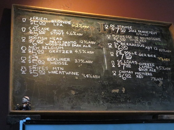
The Monk doesn’t offer food and beer offerings change regularly, so printed menus are unnecessary. We created a large chalkboard for over the bar that allows Rob to write in the latest taps and bottles, organized by glass and region. A small chalkboard sits on the bar for displaying the special Thursday night keg, and other one-night-only offerings
For the restroom, we created a special wallpaper to encourage bathroom selfies and possibly even a little graffiti.


Printed Collateral
For collateral, our solution had to be simple and inexpensive to execute: basic branded matchbooks and napkins that customers can scrawl their ideas onto.
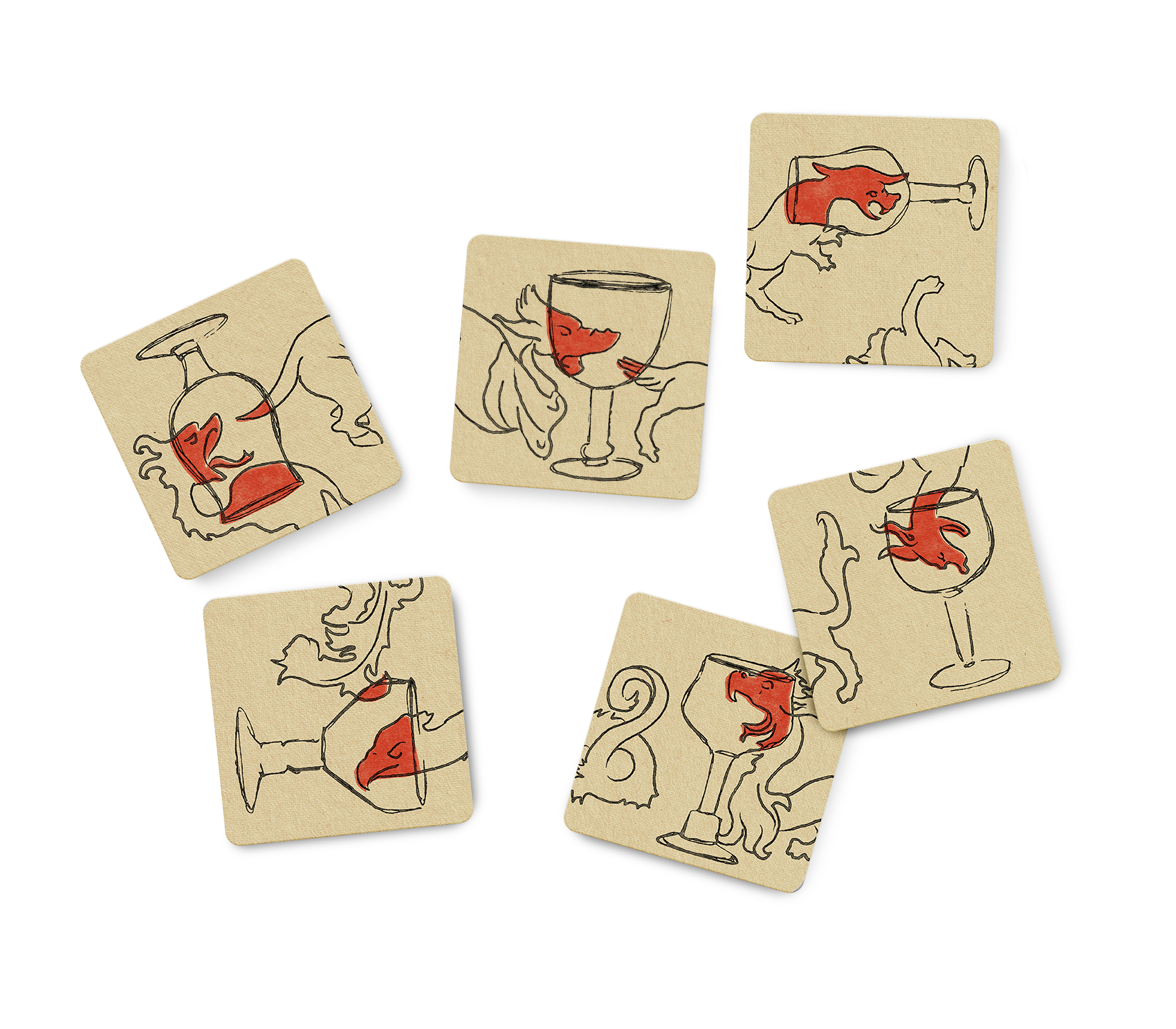
We really had fun using our character set to create a little coaster puzzle. Customers have something to collect (repeat visits) or match up with the next table (encouraging conversation) or post with their beer on social media, creating a kind of secret code that passes between their friends and fellow beer lovers.


Website
This bar doesn’t even have a phone, so email templates or Instagram ads were out of the question for a digital presence. We did a simple, one-page website that used the bar’s existing coaster art wall and added a simple, hand-drawn map, address and hours. The owner never has to update it, but it gives potential customers a window into beer paradise.

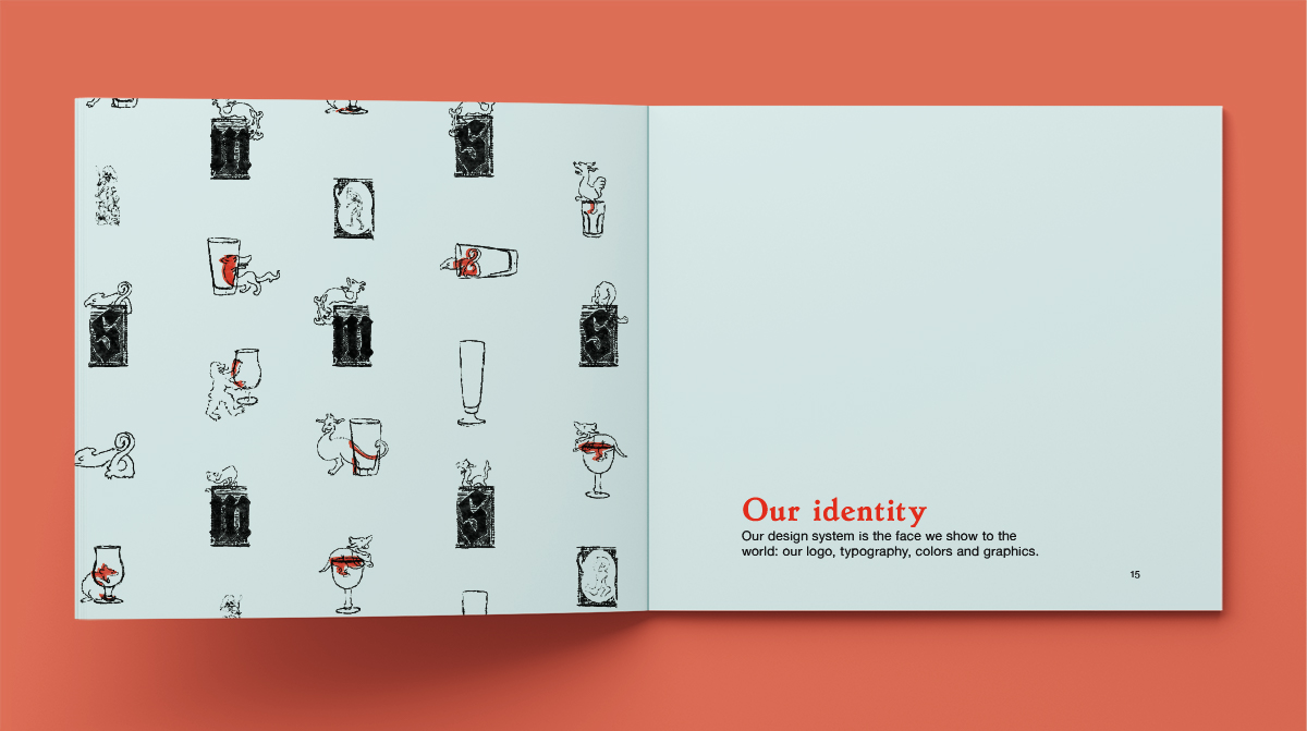
Design System
Creating texture and character
The Stumbling Monk was built by hand, much like the craft brews they serve. When we created our branding system, we wanted hand-touched elements and imperfections—nothing mechanical.
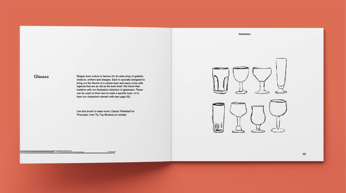
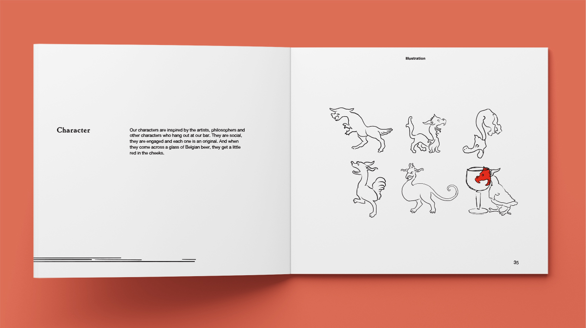
Using rough Procreate brushes and ballpoint pens, we created a set of illustrated characters and Belgian beer glasses (so important to serving this style of beer). The characters were inspired by ones found in medieval manuscripts and are a nod to the unusual people who love The Stumbling Monk and the beer so much. We have them pop up in surprising places, interacting with each other and the beer glasses—wherever the two cross, there is that pop of red.
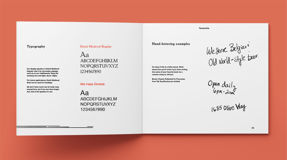
Type was minimal because most of the “menu” at The Stumbling Monk is written by the owner on a chalkboard. Where there is type, we used Dutch Medieval, an old-style typeface that’s highly legible but has some personality. For other lettering, I used a ballpoint pen to create scrawled messages—as if written by the owner or jotted down on a coaster.