
R: Razors for People
Challenge: Create an environmentally-conscious shaving brand Concept that doesn’t subscribe to the gender binary
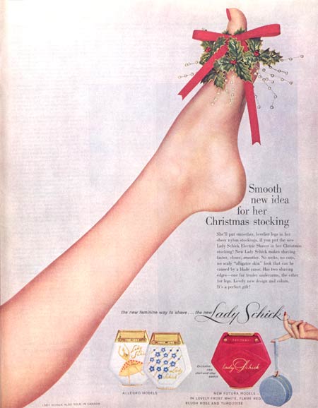
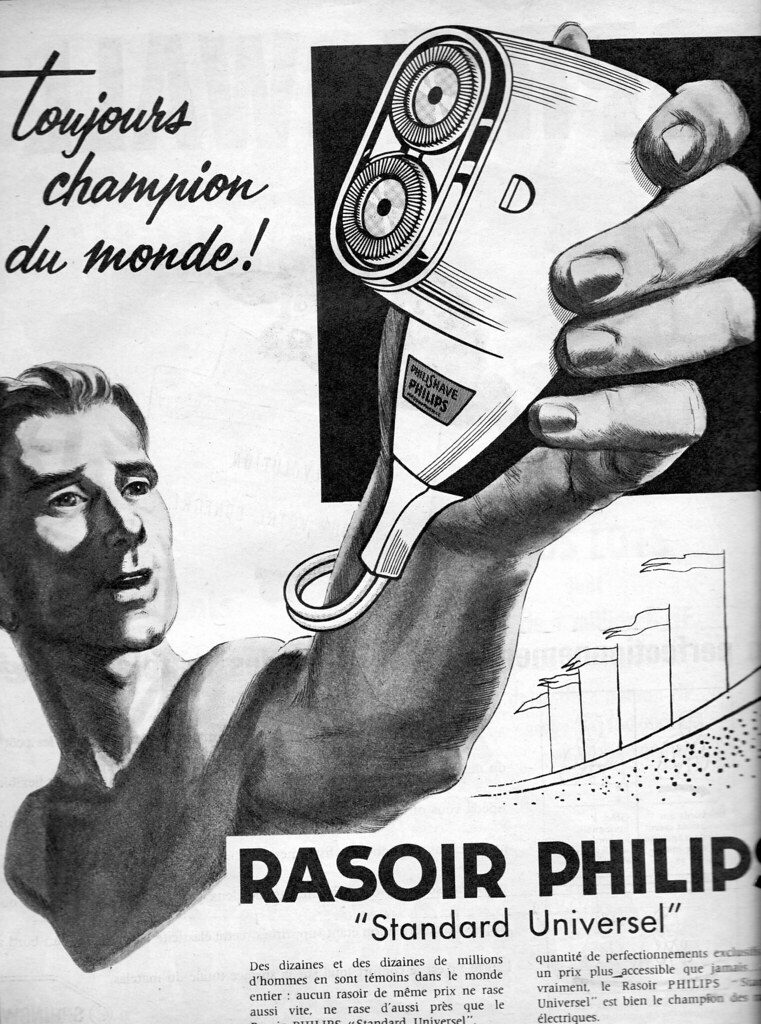
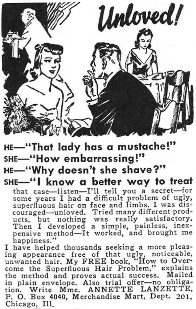
Background and Description: Conventional razor marketing relies heavily on gender stereotypes. Men are scruffy beasts who need taming; women are miraculously smooth nymphs who hang out in the tub all day. These narratives don’t serve either gender, nor do they serve the wide swath of humans who don’t subscribe to this binary system.
At the same time, we are reaching an environmental crisis point with rapidly filling landfills, sparking a need for longer lasting products. For example, socially- and environmentally-conscious Gen-Z consumers, soon to be a major market force, say they both prefer brands that don’t market to one gender, and are willing to pay more for products that last. With R, we aim to create a razor that lasts a lifetime, is less wasteful, and can be used by anyone.
Project Details
Client: Student work
Partner: Wilfred Aldrich
Roles: Branding & Visual Design, Packaging, Hand Lettering, Copywriting, Web Design, Motion Design
Skills: Photoshop, Illustrator, After Effects, Lettering, Copywriting, Research
Illustration: Wilfred Aldrich
Project Goals
Our goals for this project were to create concept for a shaving brand that was gender-inclusive and body-positive. We set ourselves the challenge to make a product lineup that didn’t contribute to plastic waste, which meant looking at options like safety razors, glass or aluminum packaging, and refillable products. A lot of shaving products are quite serious so we saw a gap in the market for hair removal that actually brought a bit of joy to a very tedious chore.
Branding & Visual Design

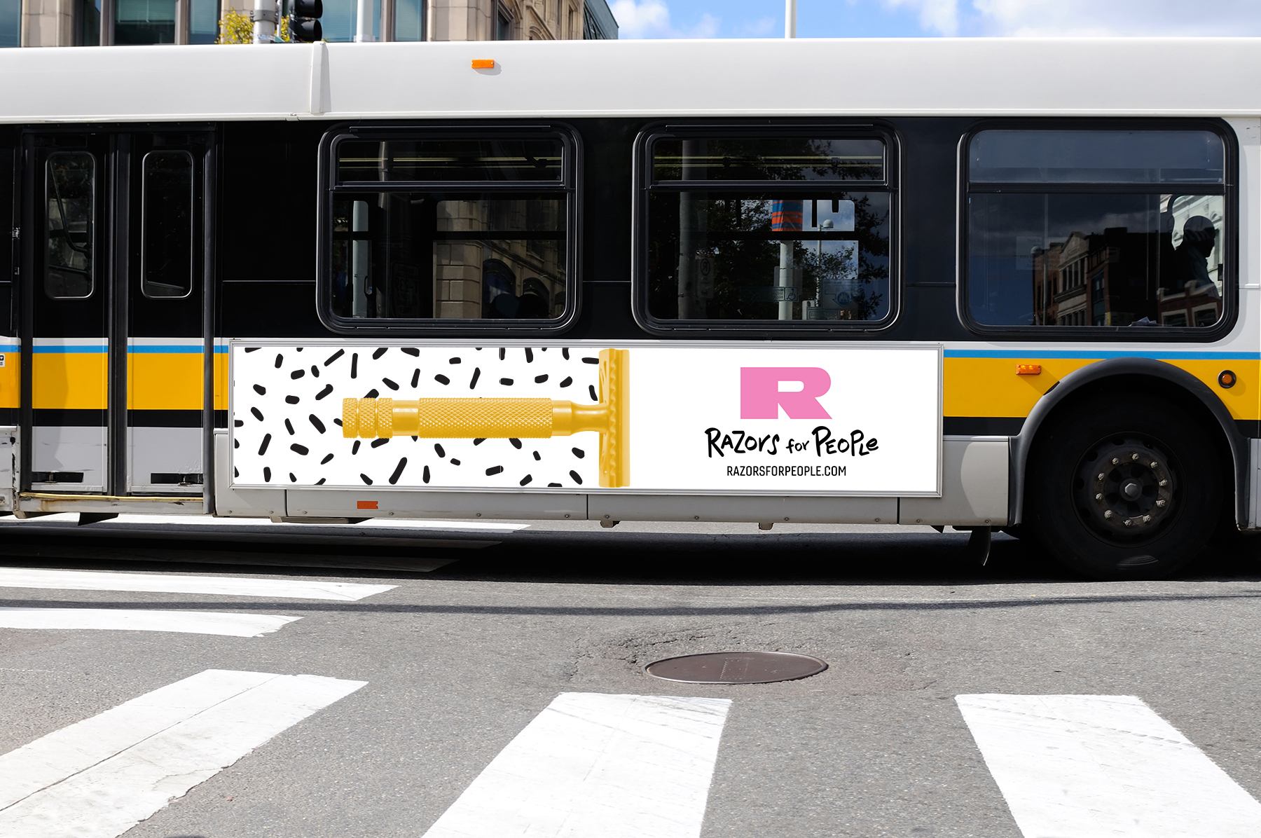
Branding: R We Having Fun?
R is the first letter of razor, but it’s also a play on Our and Are. Because the name is a single letter, the logo has to do a lot of work. After lots of sketching and going through dozens of Rs, we ended on a hefty sans-serif, Antique Olive Nord, modified to give it even more presence.
For visuals, we were inspired by illustrators like Marcus Oakley and Shantell Martin, who do a lot of black and white line work and made everything with the perfect marker—Office Depot Chisel Point Markers, $8.49 for 12. We chose a few vibrant colors for the logo and for other applications, including the website and the razors themselves.
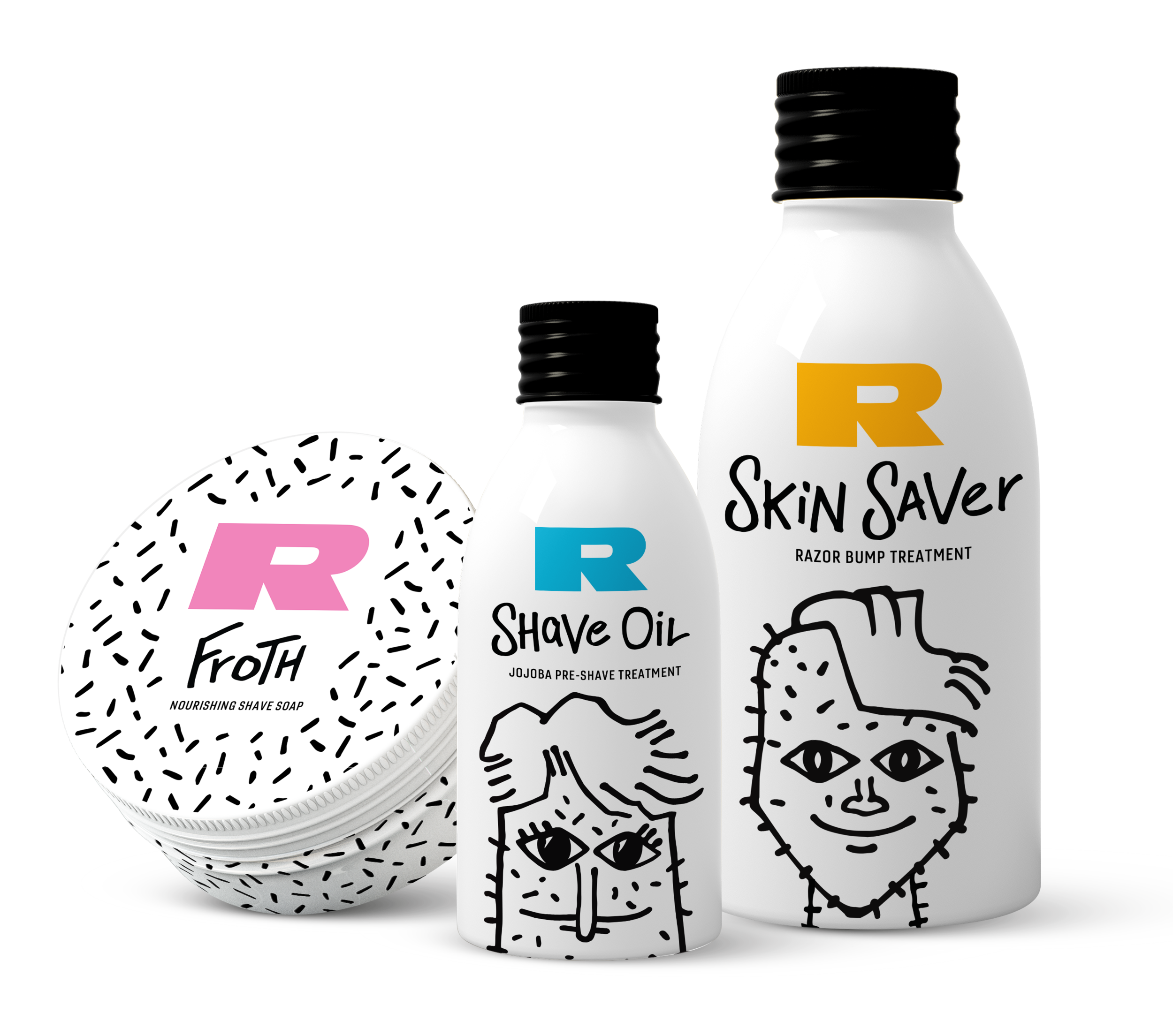
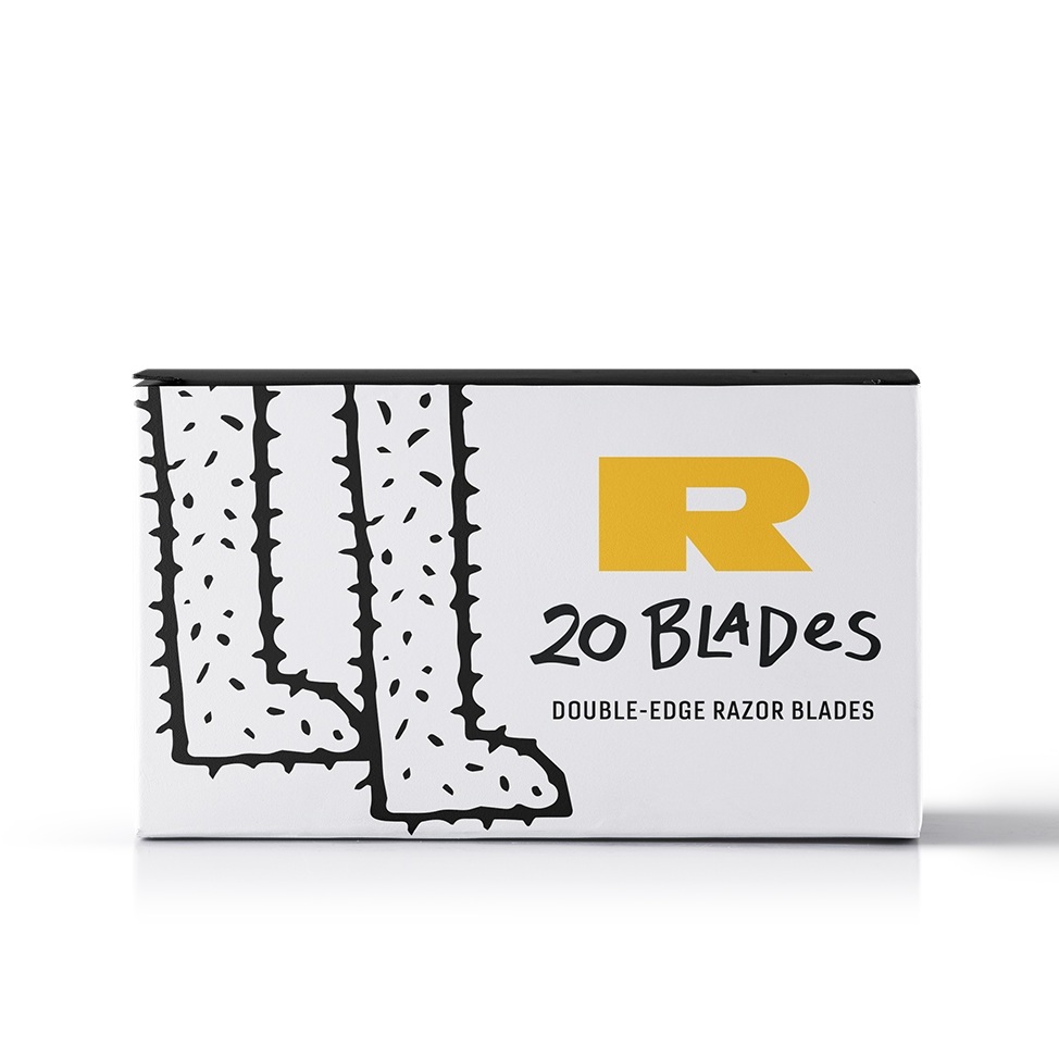
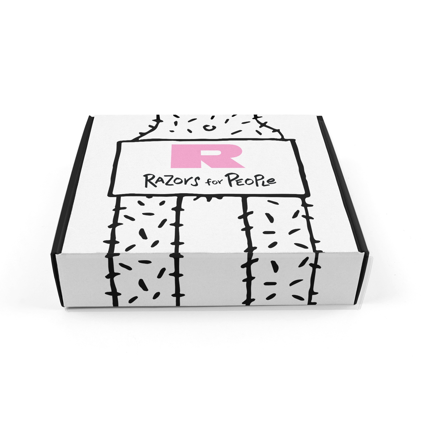
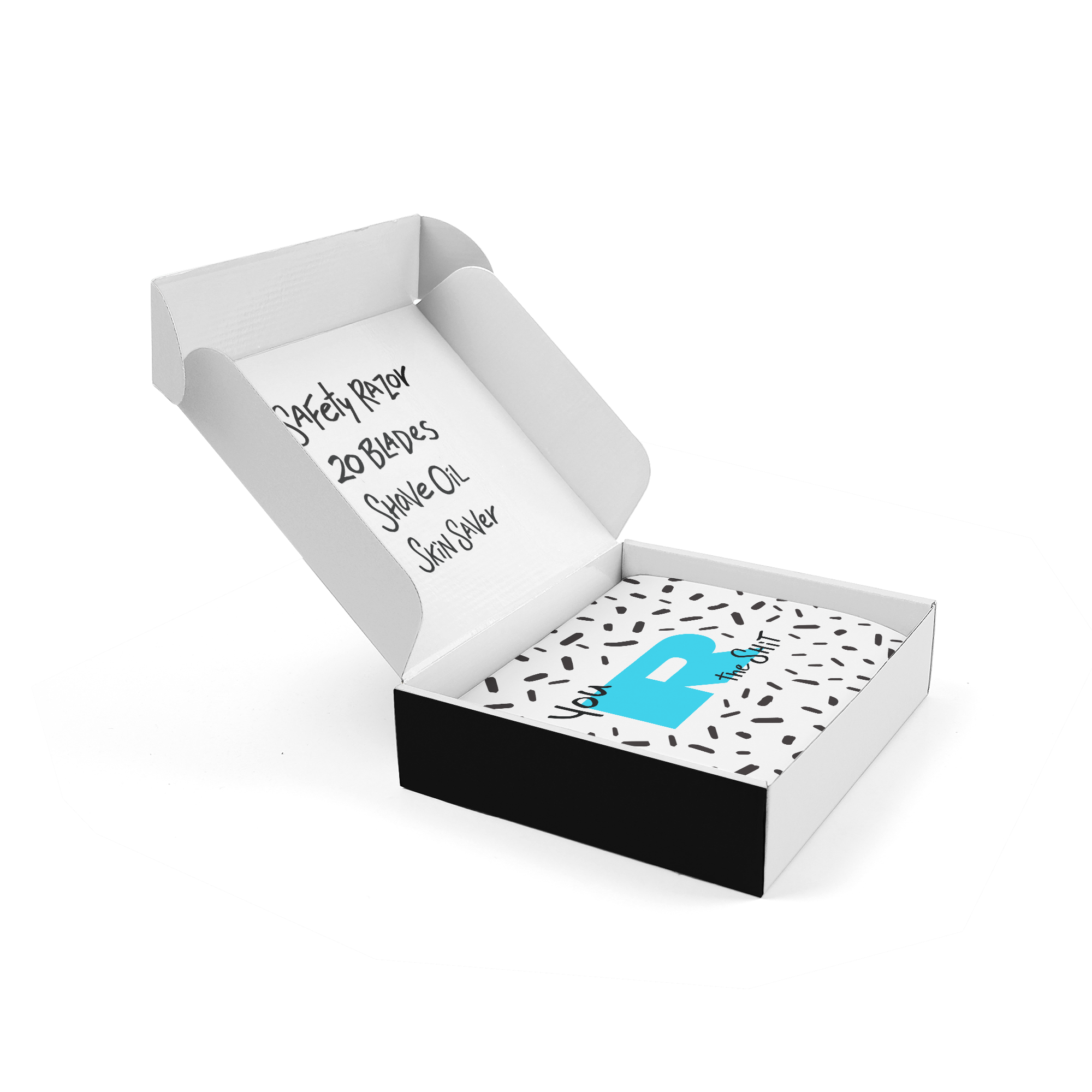
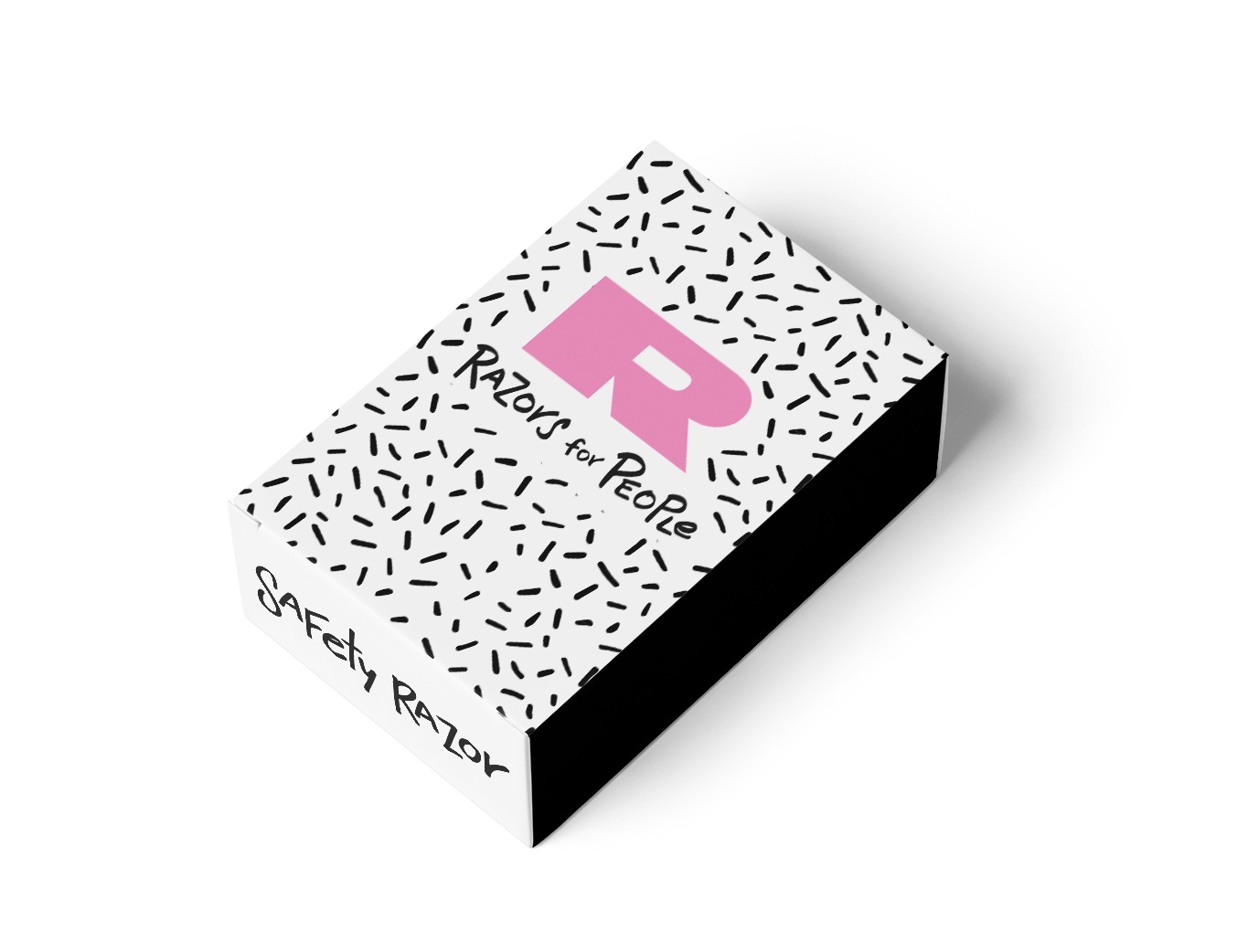
Packaging: Sustainable, Radical
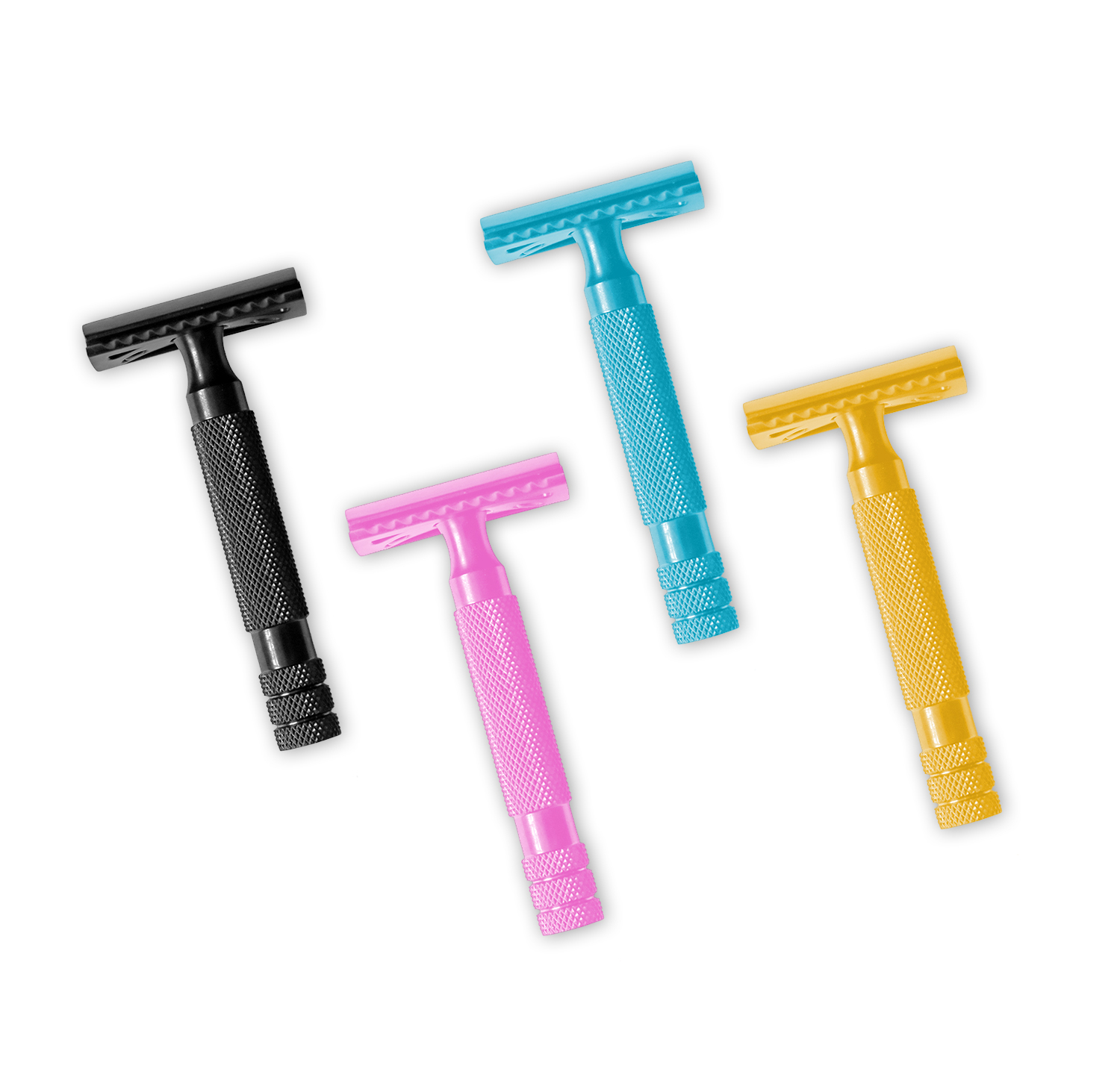
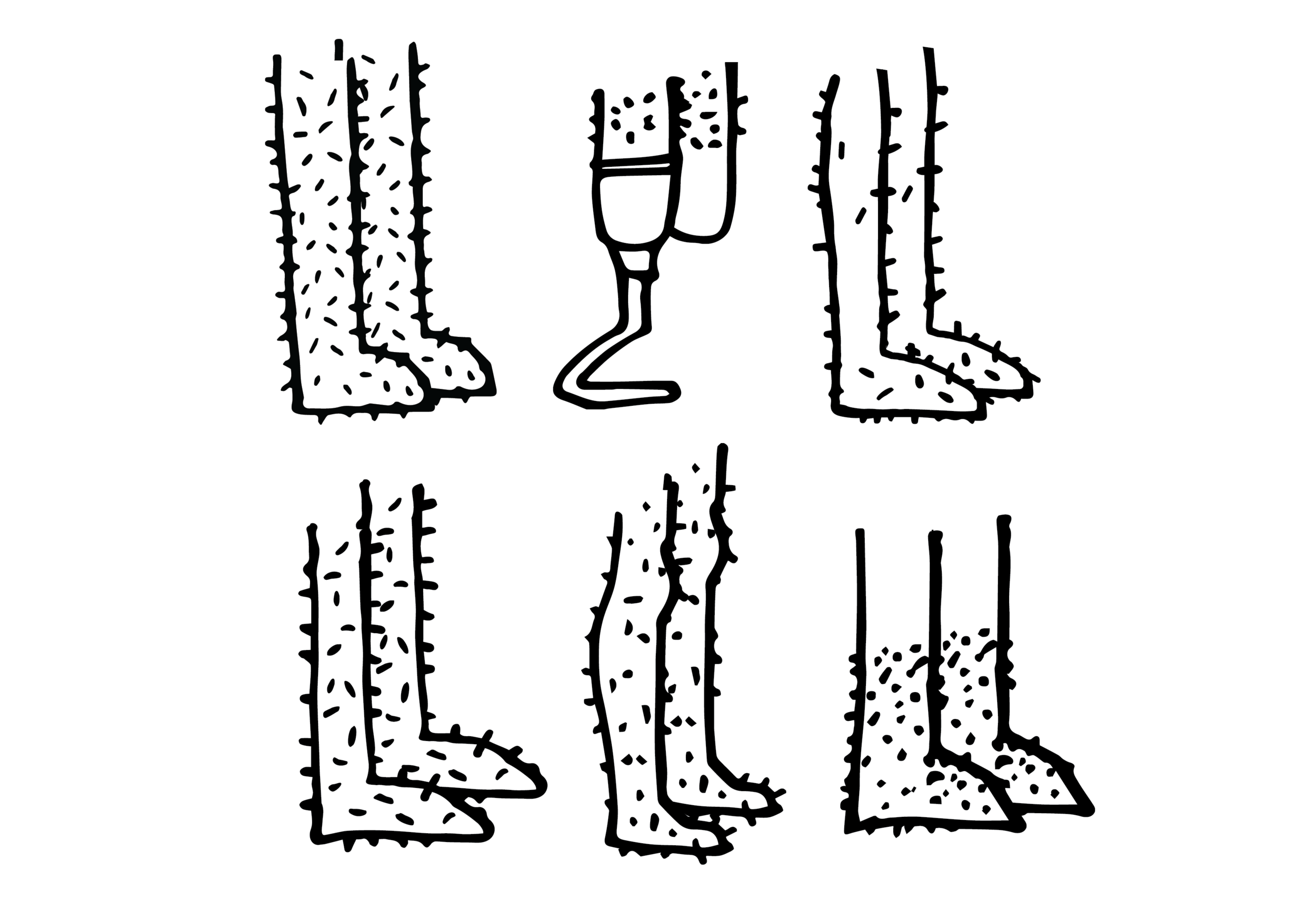
Our packaging had to be plastic-free. We decided on aluminum because it is lightweight, recyclable and doesn’t break when you drop it in the shower. The products inside don’t have any parabens or chemicals and they aren’t tested on animals. Because we have such a large library of characters, we could put new ones on the bottles every few months and treat these like streetwear drops. For the razors themselves, we chose weighted handles in anodized aluminum, which are extremely durable and can be coated with different colors—why not have a bright pink razor!
Brand Voice: Body-positive, irreverent, affirming, informative
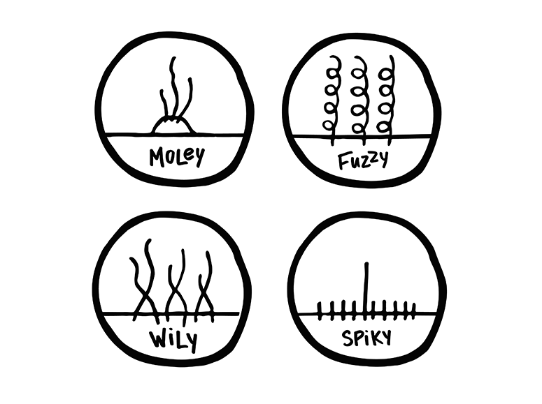
Every body is fuzzy-wuzzy
We aren’t about that gender binary. We all have hair. We all have bodies. And we all have body hair. You might like yours fuzzy, furry, slippery or spiky, but you don’t like your razor to tell you who to be.
We created R for everyone. Our sleek, durable-as-hell razor is going to shave your body and your budget, and save the planet from a ton of plastic.
Everybody wants that.
You aren’t plastic. Neither R we.
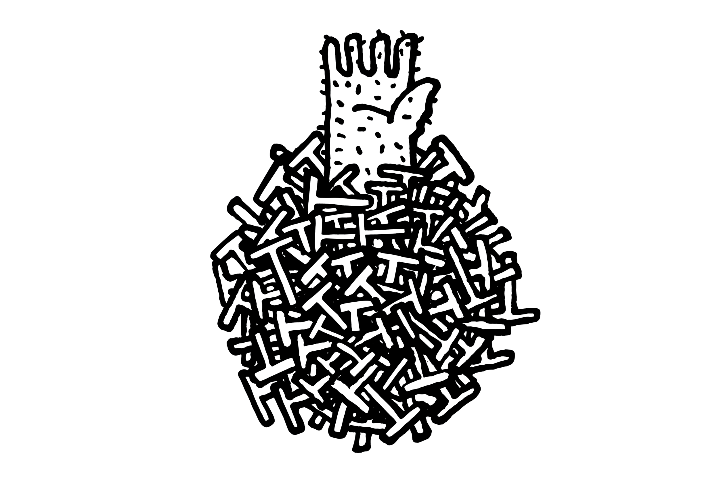
Don’t be a statistic! Over two billion plastic razors and cartridges and end up in landfill every year. Gross, right? Our blades not only let you go plastic-free, but you can also return them to us for a credit o your next purchase.

Advertising & Motion
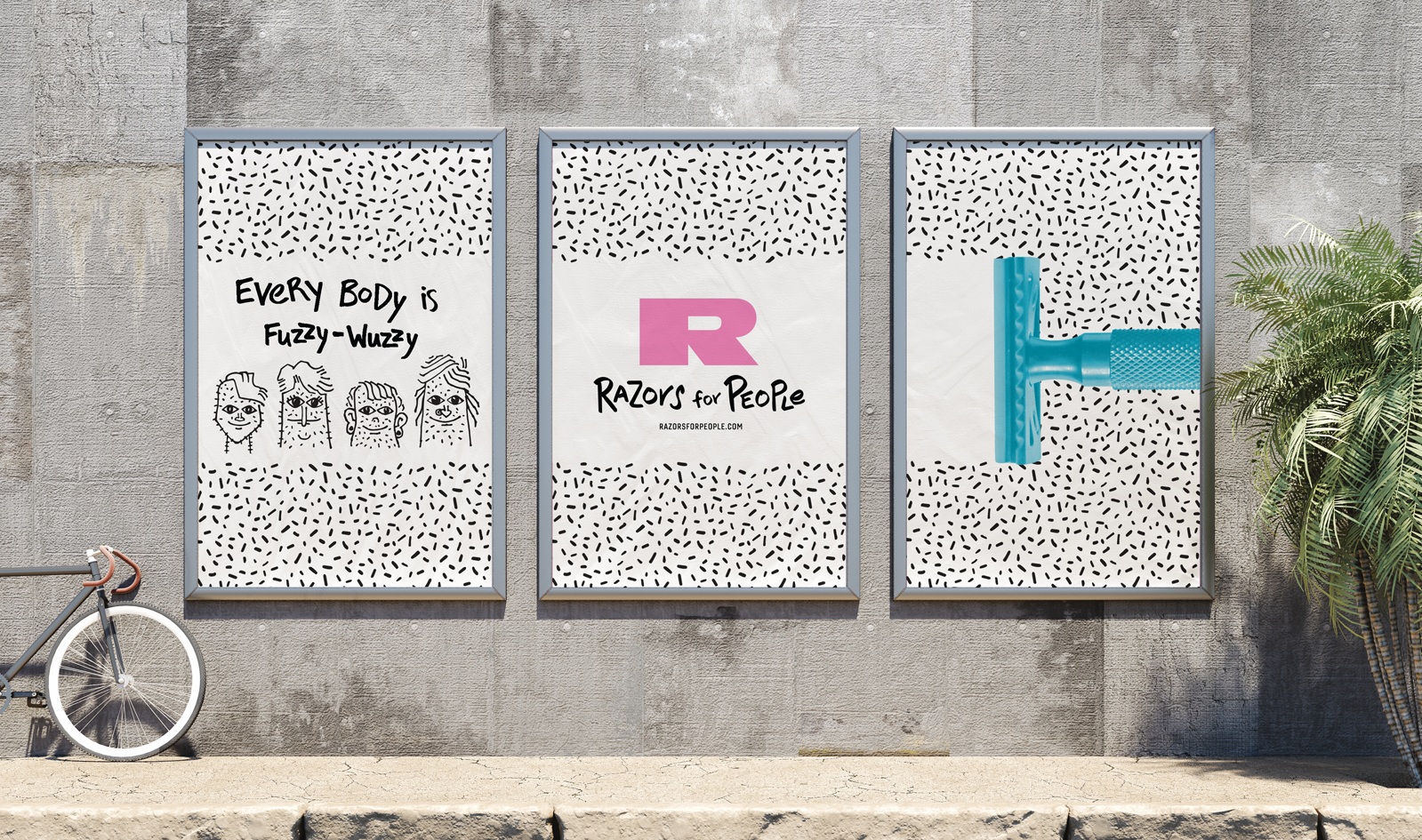
Advertising: Every body is fuzzy-wuzzy
Our ad campaign features one of our razors shaving through a field of stubble. For larger ads, we can bring in the characters and tag lines, and for smaller ads, such as a small banner, we can just feature the razor and the logo/tagline. Our target for the digital/motion ads would be the WBNA network of sites, as well as a number of queer media sites.
We had a lot of fun bringing our hairy people to life in a suite of Instagram Stories ads. These express our two main pillars: body positivity and eco-consciousness. In the future, we can add education to our suite of motion pieces—showing users how and why to use a safety razor.
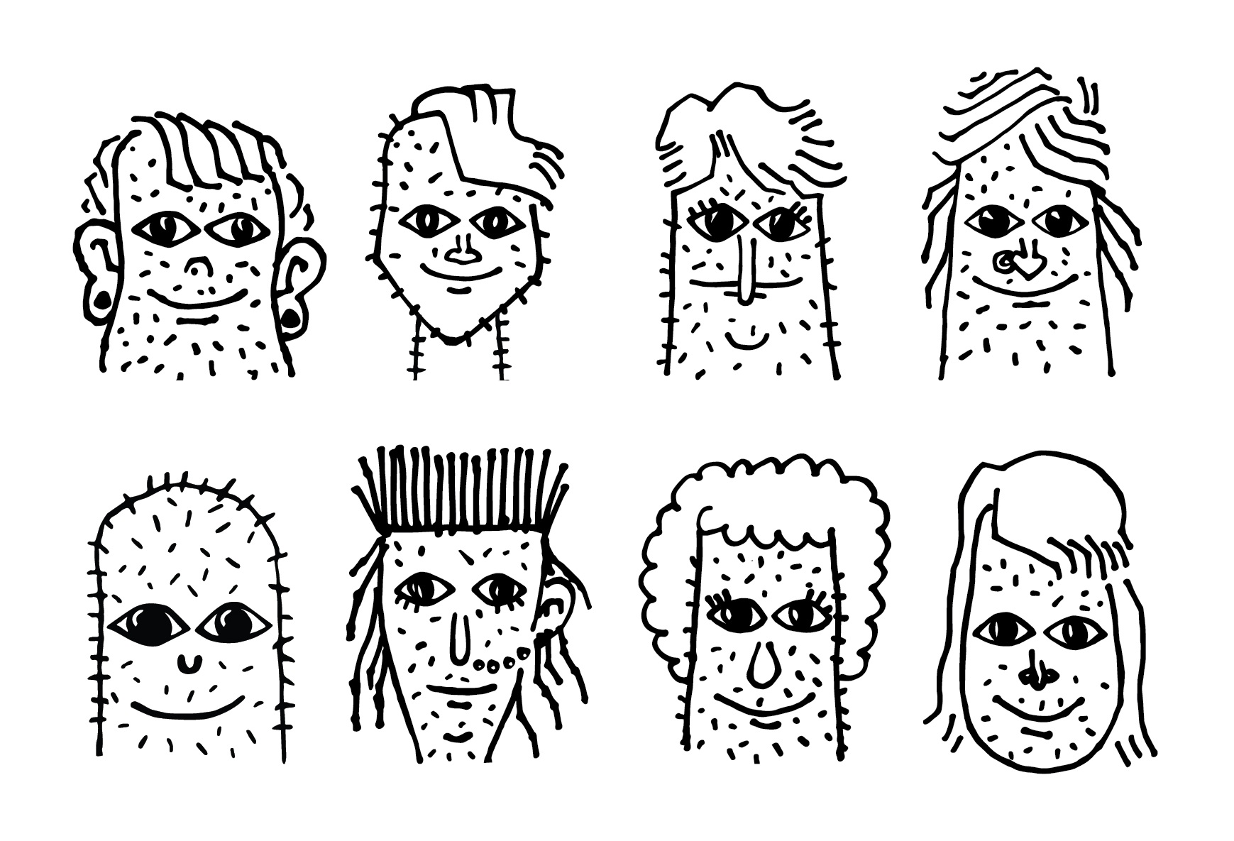
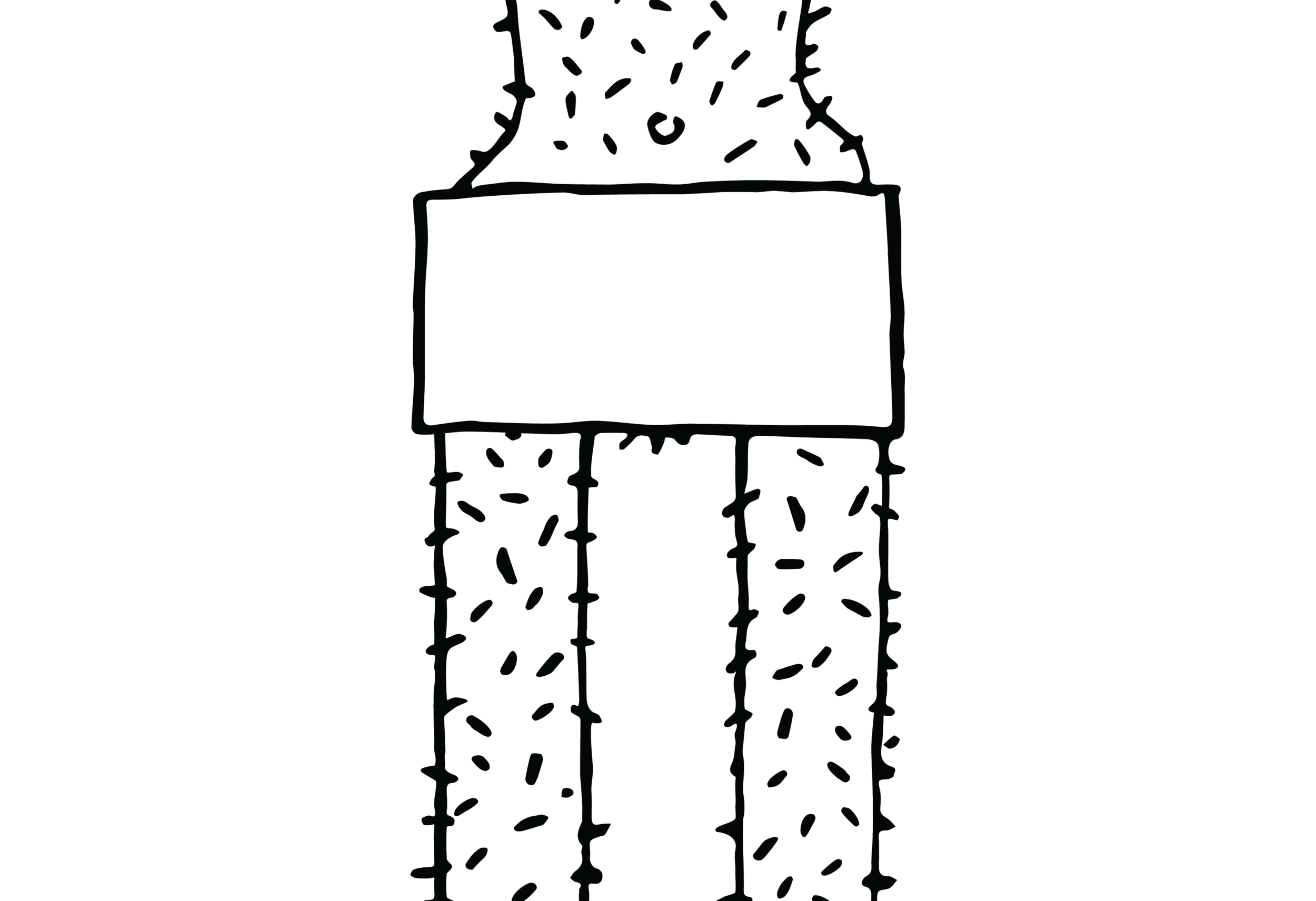
Illustration Style
The great Wil Aldrich created a cavalcade of hairy characters to be the faces of R. We aimed for features that didn’t express one particular gender, but did express lots of stubble! Wil gave them hip hairstyles, nose rings and big smiles. He also created a library of hairy body parts—everything from toes to tongues—and little spot illustrations of different hair types. These can be used on packaging, on the website, in ads and social media.
To add to the energy of the characters, I created a suite of off-kilter hand lettering for product names, advertising and display.
Website
Razorsforpeople.com brings together all the elements of our brand to create an engaging and informative site for consumers. Our aim is to introduce users to our product line and our mission, inform them about the environmental impact of shaving, and lessen the intimidation factor of safety razors. Beyond being an e-commerce platform, I see potential for further content strategy, not only for skincare, but also for gender equality and environmental advocacy.
