


Chong the Nomad/Stas Thee Boss Album Cover
Challenge: Make an album cover for a split LP featuring two separate and very different artists.
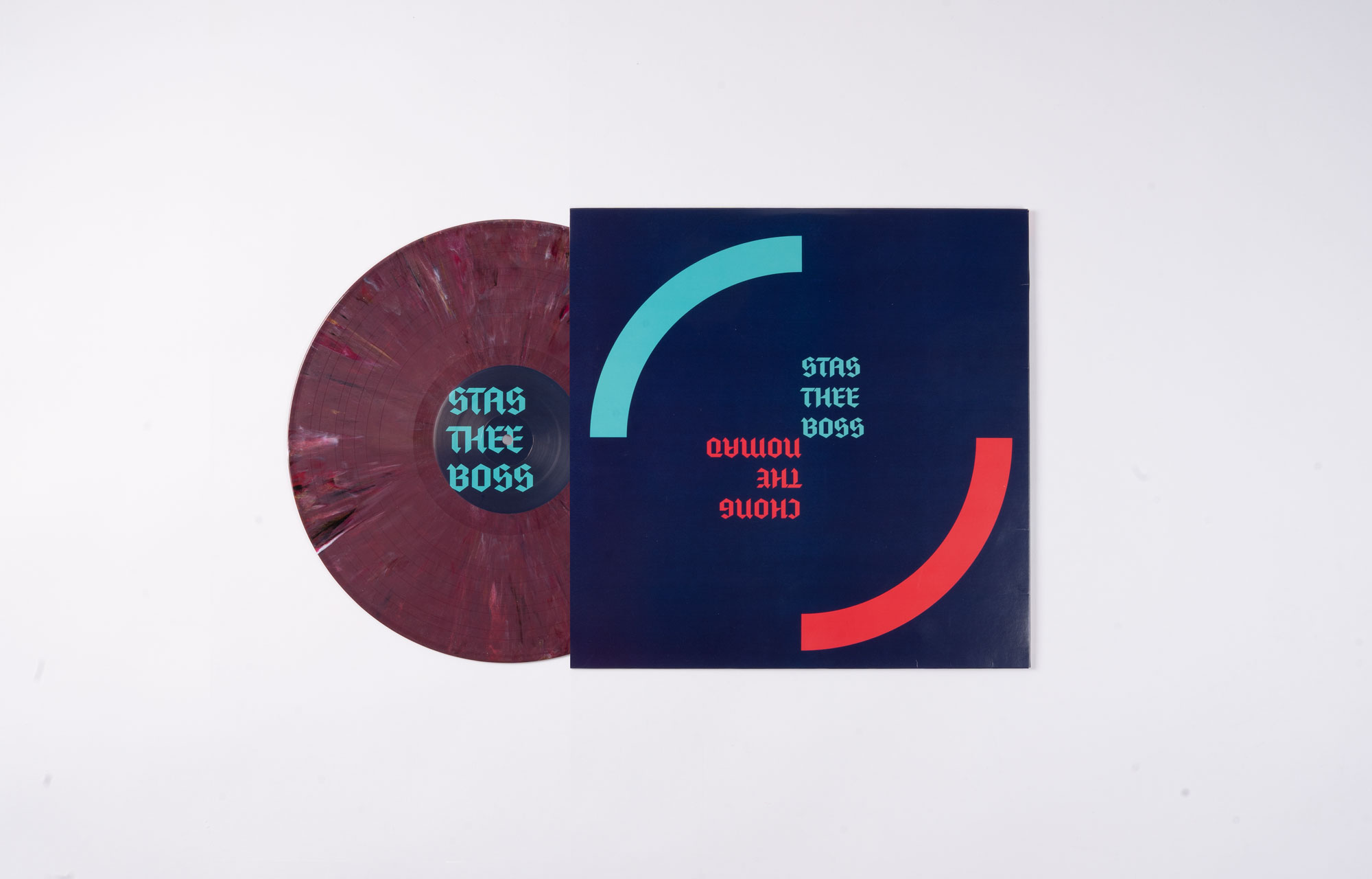
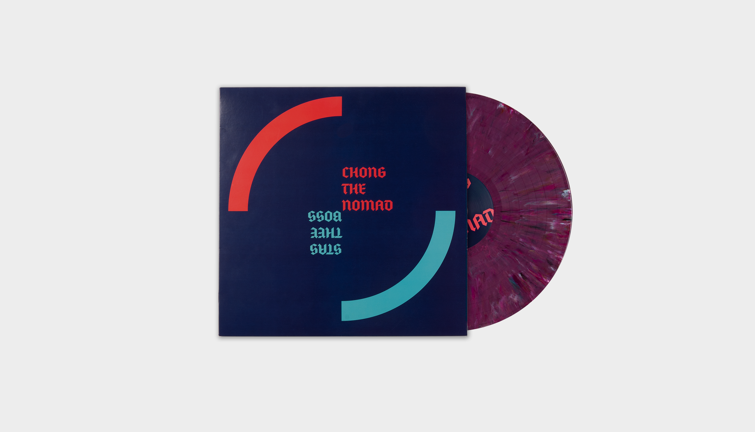
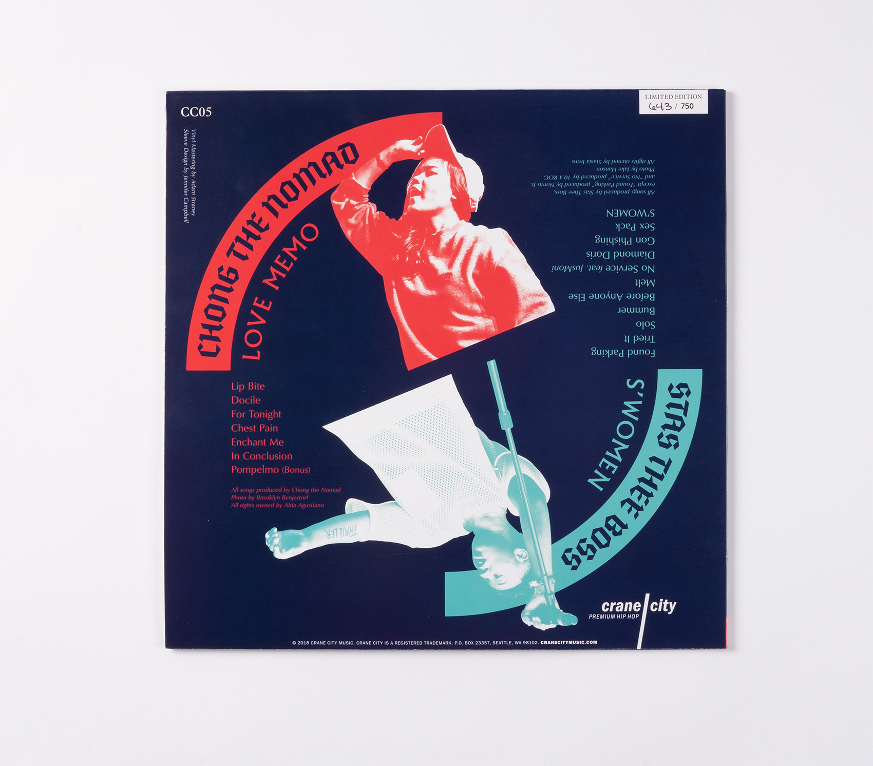
Crane City Music is a Seattle-based record label that makes vinyl-only releases of local rap and hip-hop. This split LP features two previously-released EPs, Love Memo, from up-and-coming beat maker Chong the Nomad, and S’Women, from prominent local musician and DJ Stas Thee Boss. For this project, I needed to create a sleeve that made it clear that these were two separate albums on one disc, and that captured the energy of this dynamic music.
Project Details
Client: Crane City Music
Timeframe: 5 weeks
Roles: Art Direction & Design, Production Liaison
Skills: InDesign, Photoshop
Goals: Communicate two albums on one disc; express the creative energy of the music
The music
One thing that’s clear when you listen to this music: These artists are very different. Chong the Nomad’s electronica is made from found environmental noises—from instruments, from her voice, or from the kitchen of a ramen shop. Stas Thee Boss creates cheeky and transfixing grooves by chopping up samples from old jazz and soul records.
Concept & Visual Design
Concept development
Because both of these records were previously released with their own covers, I chose to make this sleeve more about the split LP format, rather than trying to smush together two styles.
My challenge in sketching was fitting information for two albums into the space of one. I explored a number of layouts before landing on a circular composition that represents the shape and movement of the vinyl and gave the back cover a more dynamic form than two side-by-side rectangles.


An early iteration before the succulents were nixed.
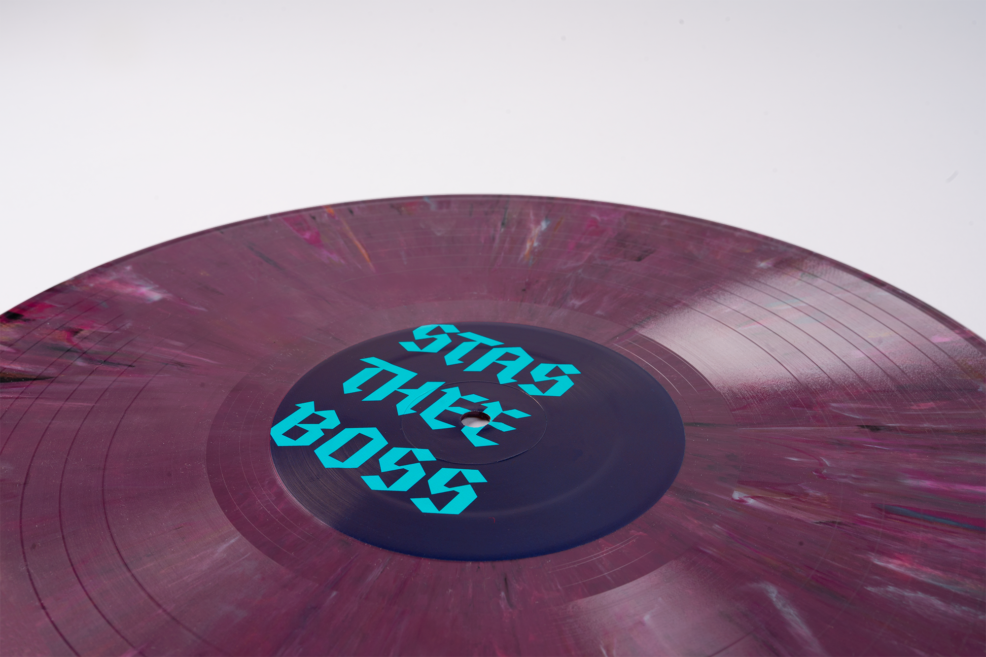
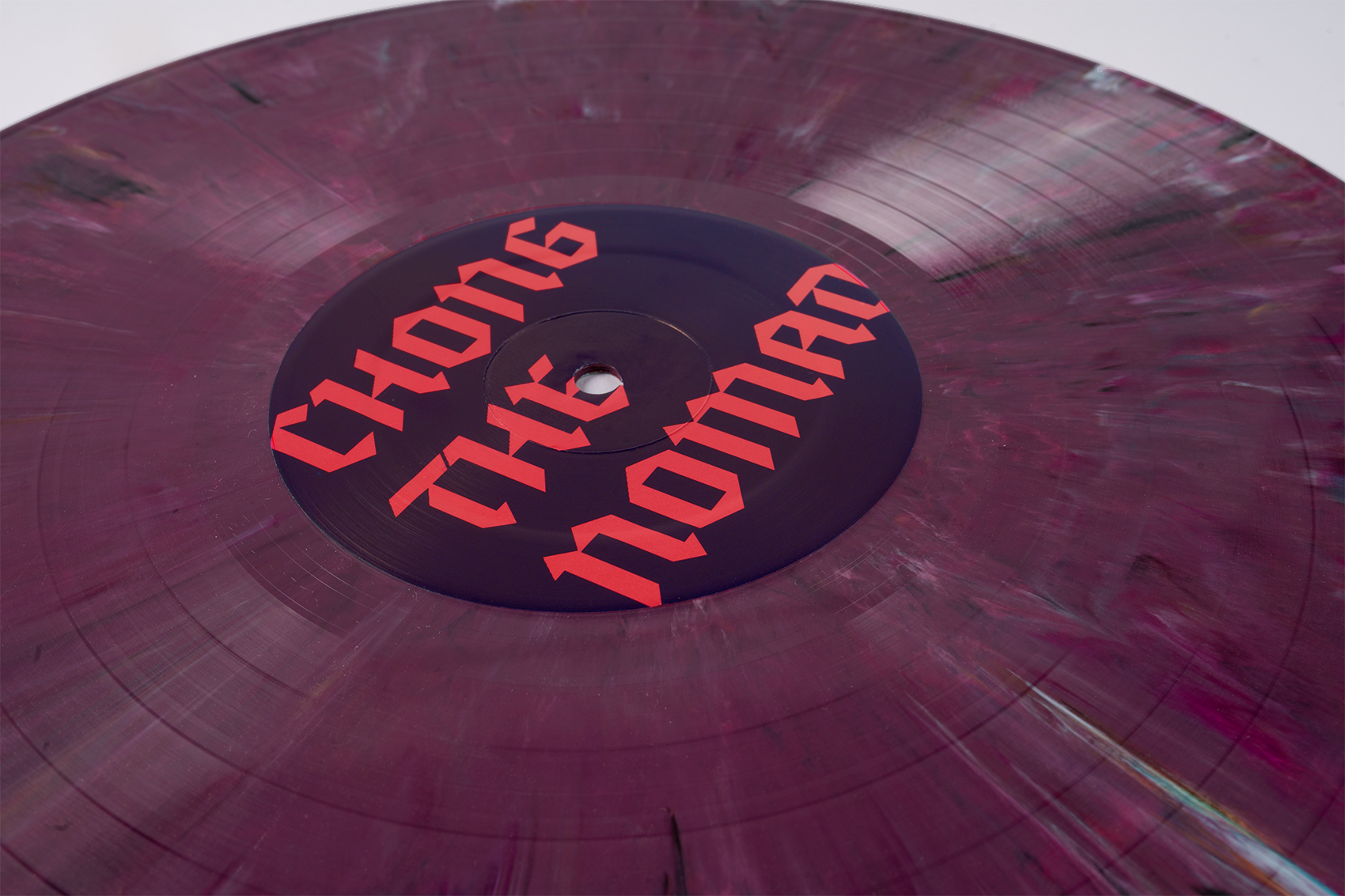
Double A-side
Because the albums are of equal importance, the design of the sleeve is reversible. Each artist has her own side and color so she can flip it their side up at shows. I underscored this energy by choosing photos of these artists in motion, performing.
I initially explored a photographic solution to the front cover, a photo of succulents manipulated to look like they were under a blacklight, but after some artist feedback (no flowers!), I opted for a simple, graphic treatment that reflected the circular composition on the back. For the type on the artists’ names, I used Fleisch Wurst, a sharp-edged blackletter that nods to a current trend in hip-hop design, but has a super-modern digital look.
The Album IRL
In the wild
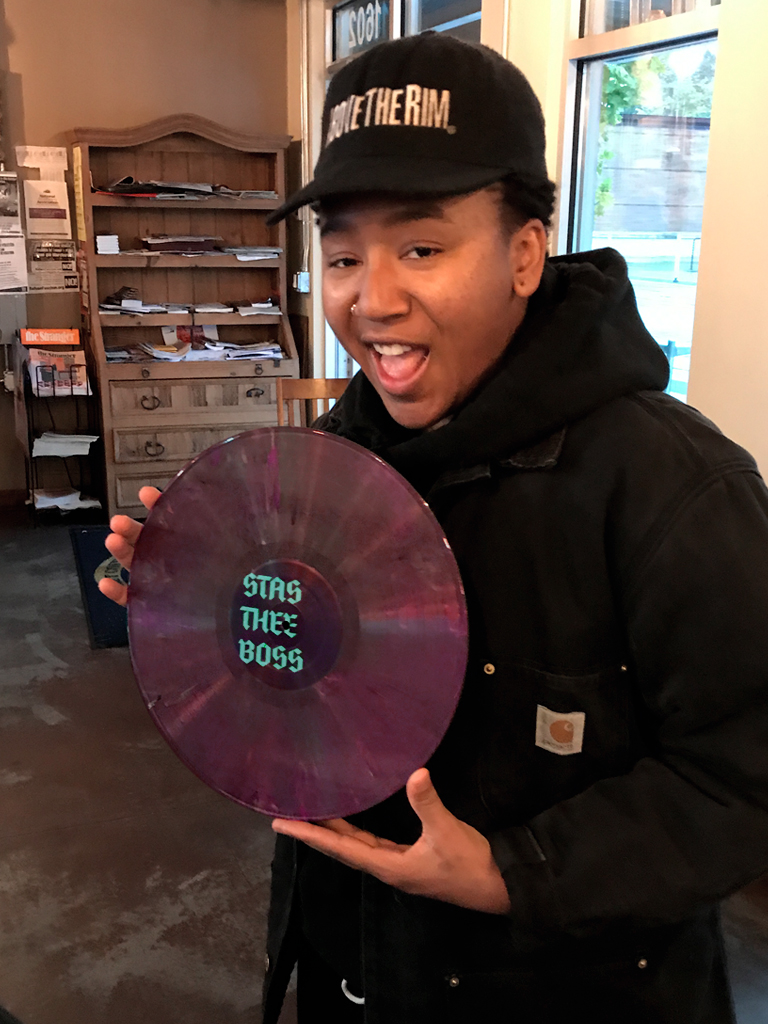
It’s so satisfying to see this work in the hands of the artists. That’s Stas below, on the right. On the day her records were delivered, a fan asked her to sign one only a few minutes after they arrived. Chong is posing with her cover of The Stranger, which came out around the time of the vinyl release.

The album is in stores around Seattle and around the world. Seeing the cover out in the world, I’m really happy with how well it stands out on shelves. Here’s some feedback I got from Jason Grimes, the owner of Seattle’s Spin Cycle Records:
“That Chong/Stas cover was especially fun for me running a record store. The play with a ‘split’ is usually front to back, one artist on each flip side. It’s a design as old as punk. To have a flat square that I can flip 180° ... I’ve literally never seen it done. Pair that with the subtle spiral design, the visual suggestion to give it a spin. It’s a lively cover that plays with something I touch every day.”
