
Green Lake Park
Wayfinding Concept
Challenge: Create a signage and icon system for Green Lake Park that helps visitors navigate the large park’s many activities.
Green Lake Park is a popular park located in Seattle, Washington. The park is a destination, both for its freshwater lake and for its busy recreational loop path. For the new signage system, I wanted to build something simple that would help visitors navigate and engage with the park, but not detract from the natural environment. The new system includes a map and icons, as well as directional and regulatory signage, and public art that highlights the park’s history and wildlife.
Project Details
Client: Student work
Roles: Visual Design, Wayfinding, Typography
Skills: Procreate, Illustrator, Icon Design
Project Goals
The goal for me was to create attractive signage that gives visitors necessary information in an easy-to-access way, but doesn’t detract from the natural environment. After a visit to the park, I found there were few designated meeting points and it was sometimes difficult to tell where you were along the 3-mile loop. I am unfamiliar with the landmarks in the park so I wanted to use color or some other element to create regions and meeting points along the loop. In my research, I was inspired by printed material from the Aqua Follies—a water ballet from the 1950s and ’60s that played in the once vibrant Aqua Theater—and wanted to fold some elements from those into my final design.

Providing music for the run by Jason Burrows licensed by CC BY-ND 2.0
Design System
Creating Zones
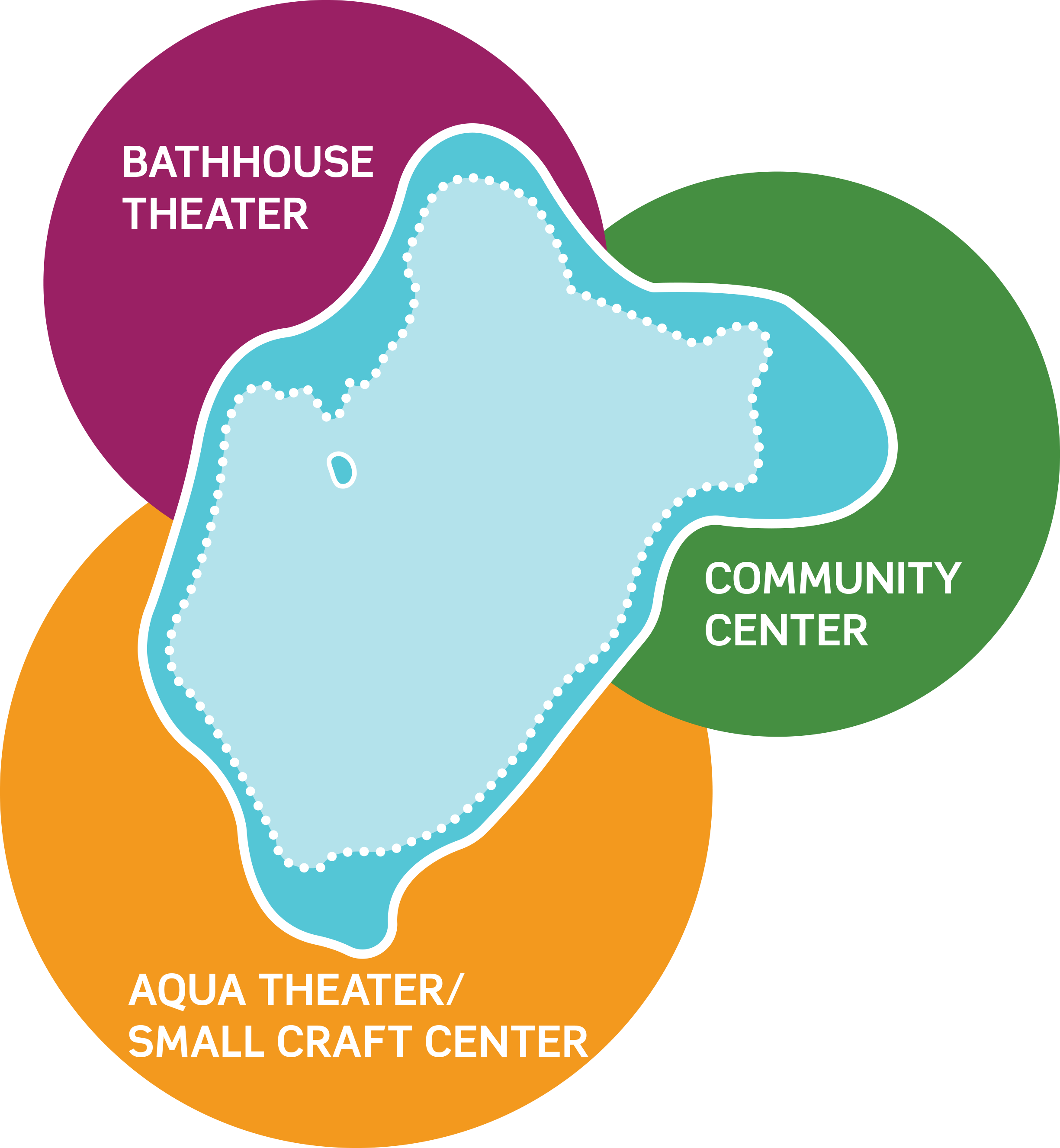
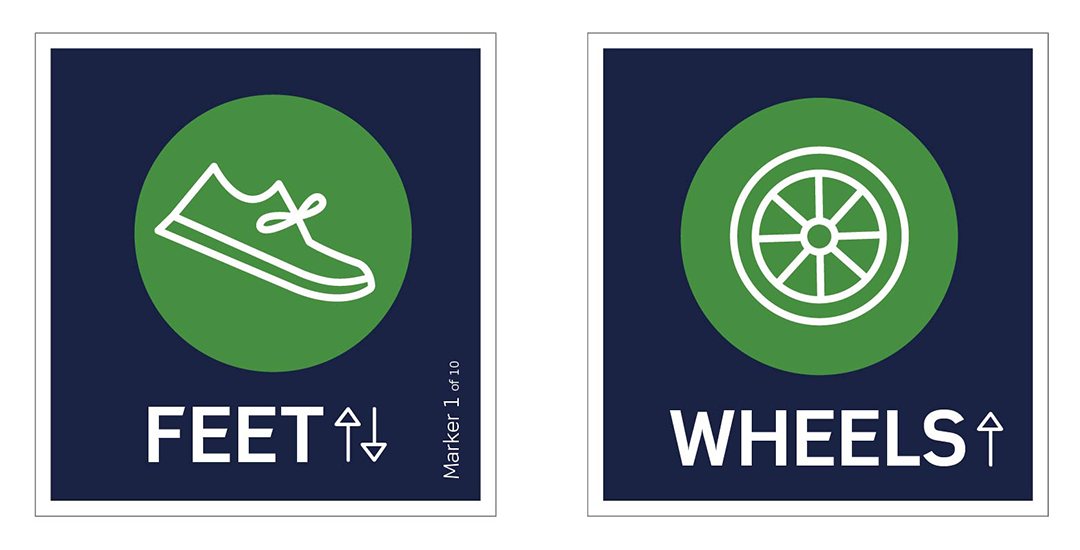
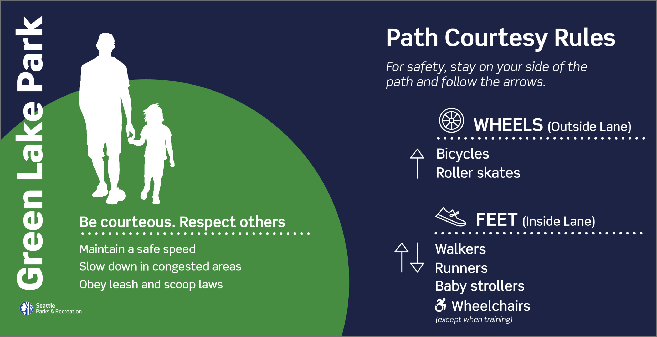
I created a zone system, indicated by three unique colors, to help with placemaking and location within the park. Icons and signage in each zone used the designated color, so even those people who are unfamiliar with landmarks can identify and communicate a meeting point. (For example, the concession stand in the orange zone.) The colors would work to help visitors quickly place themselves, and their desired activities, within the park.
Icons & Graphics
To further help with visibility of information, I used circles as the main conveyors of color in my design. Circles are both attention grabbing, and reminiscent of the shape of Green Lake. Where I could, I used a continuous line for the icons as a nod to the loop path. The icons are also contained within a colored circle that corresponds to the zone of that amenity. Parking and restroom icons maintain their color across zones.

Park Signage

Signage System
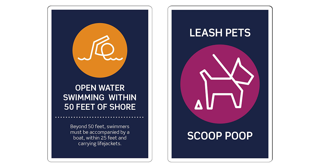
Green Lake is a well-used park with a wide variety of activities. It is popular with families, tourists, cyclists, bird watchers and athletic groups. The signage system has to convey a lot of information—the location of landmarks and activities, park regulations, rules and directional information for the loop path—in a way that was accessible to the most number of visitors.
For the main type, I chose Scene, a large family with a high X-height to assist with readability. The brightly colored circles are highly visible against the dark blue background I chose for the signage, making it easier for visitors to identify important information and locate which zone of the park they are in. I also worked to comply with ADA contrast standards for visitors with visual impairment. I used icons where possible to help non-English speakers access the park.
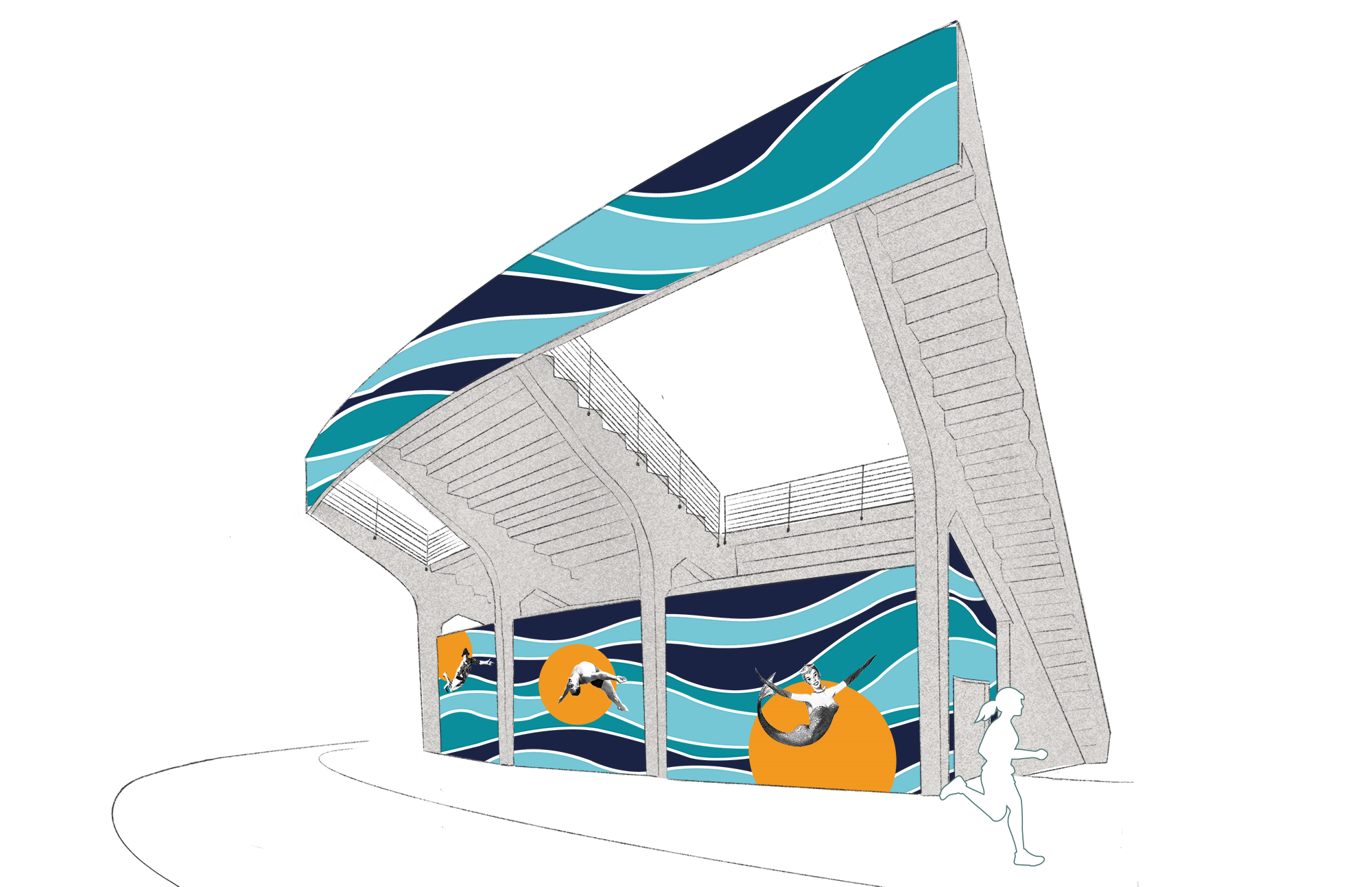
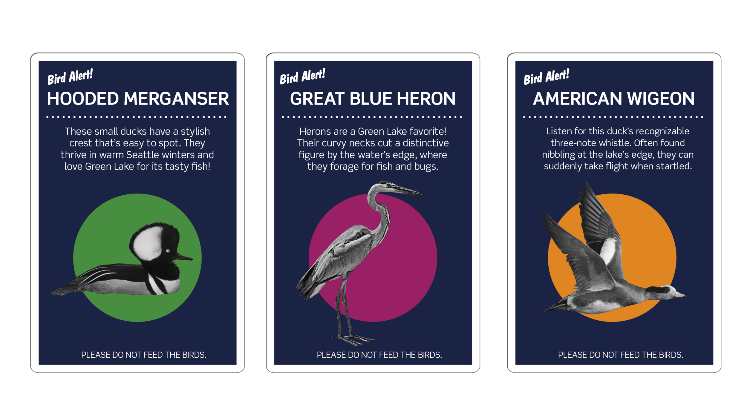
I added a number of secondary elements, including black & white cut-outs and retro-inspired type to denote point-of-interest and historical information, as well as children’s educational signage highlighting Green Lake’s many avian residents.

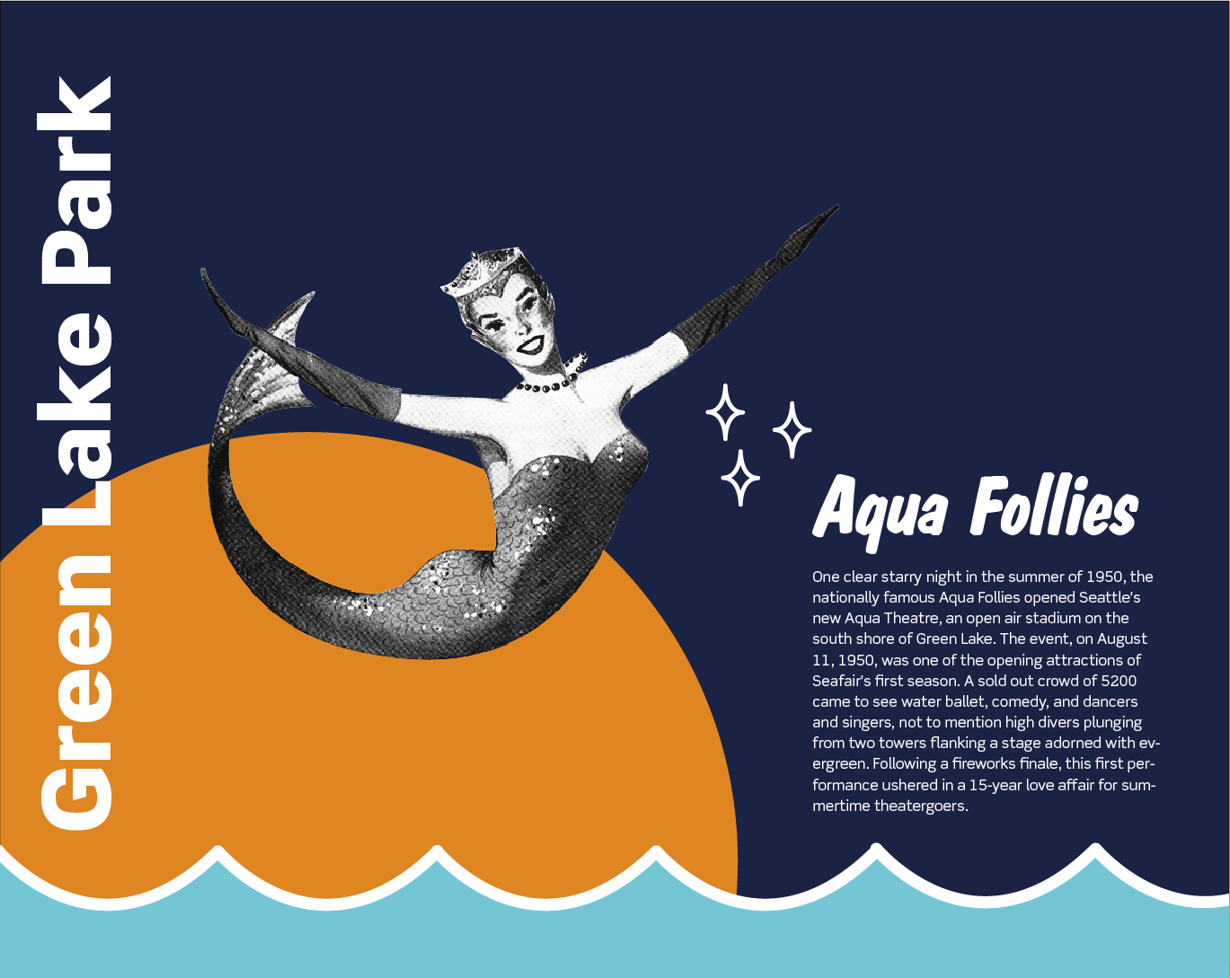
Aqua Theater and History signage
Opening in 1950, The Green Lake Aqua Theater hosted classical performances, rock concerts, and operettas, all performed lakeside to sell-out crowds. Most notably, it was home to the annual Aqua Follies, a spectacle of water ballet, high diving and singing and breathtaking high dives. The theater now exists as a ruin—and a potential canvas for placemaking. To bring in some of Green Lake’s history into the current signage, I took my secondary colors (shades of blue-green) and graphics from the Aqua Follies printed posters and programs that are on display in the park, remixing them with the new graphic style. For future history or point of interest signs, I can use this same black & white cut-out style
For the Aqua Theater, I took a wave pattern from one of the Aqua Follies programs and updated it for the new look of Green Lake. I used the circles to highlight some of the Follies’ most beloved performers and characters.